Lipsky & Sons | Wanaka
THE BRIEF
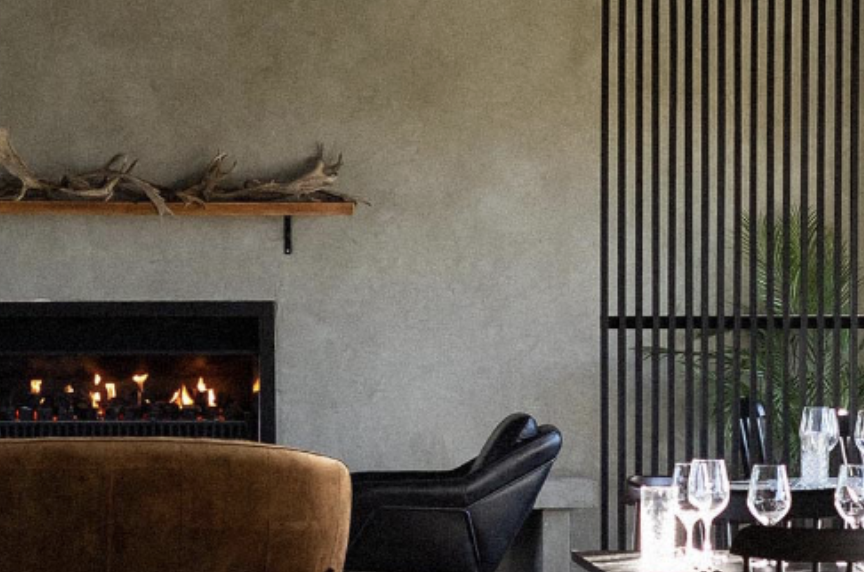
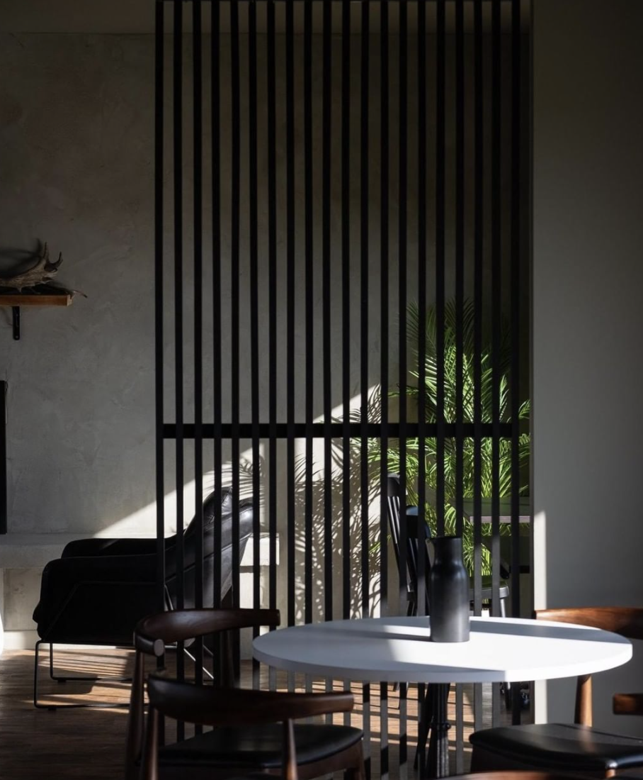
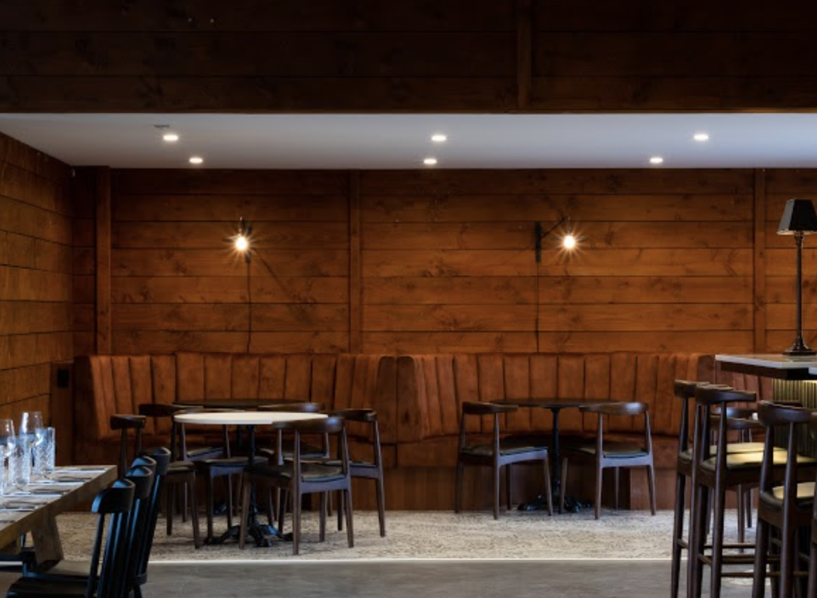
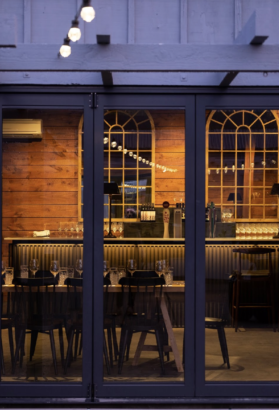
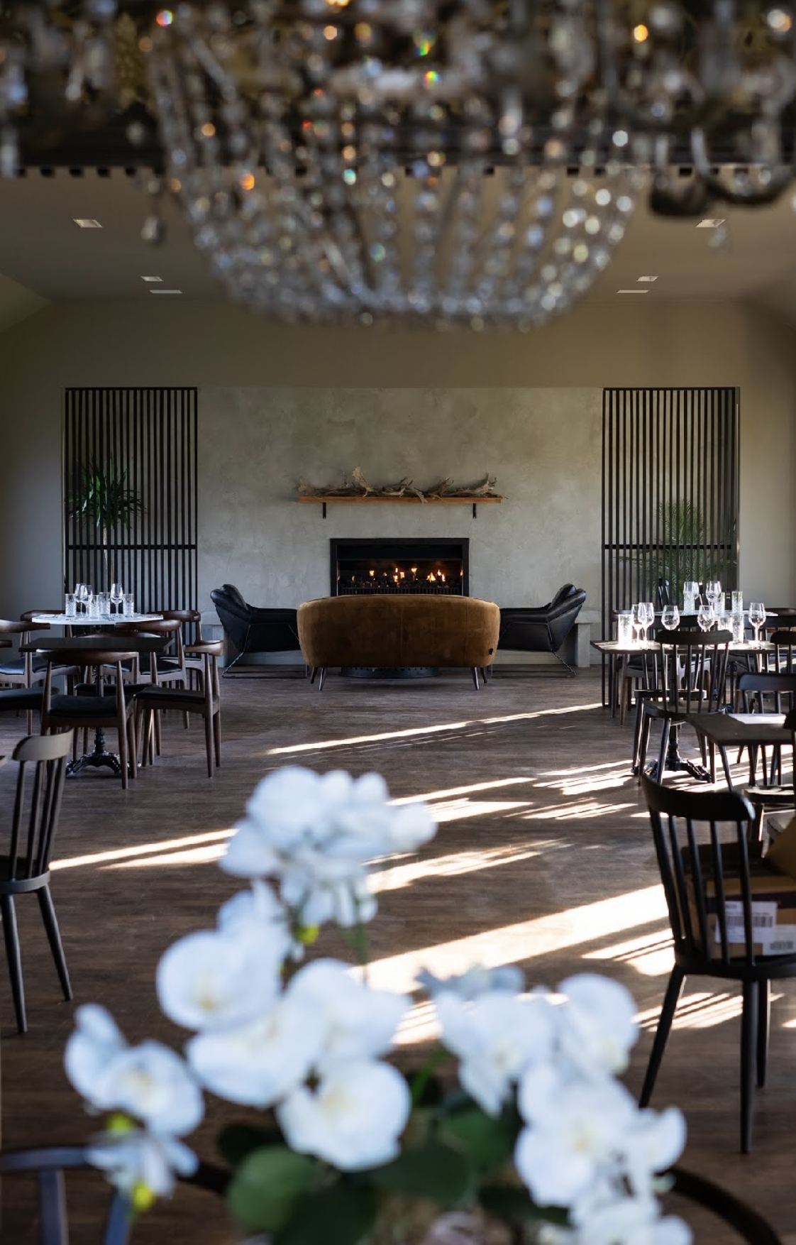
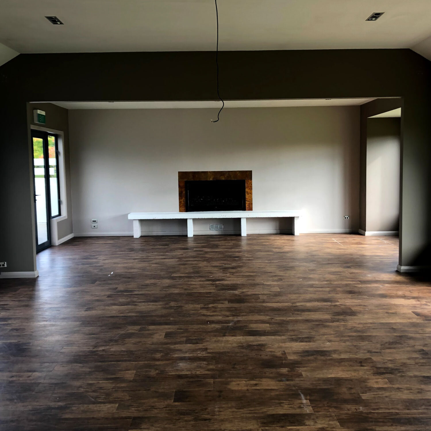
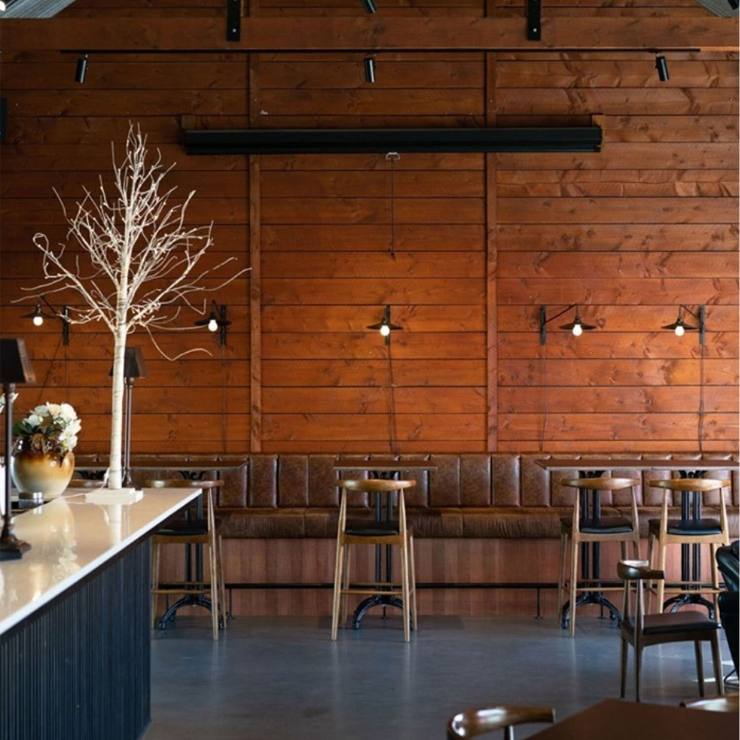
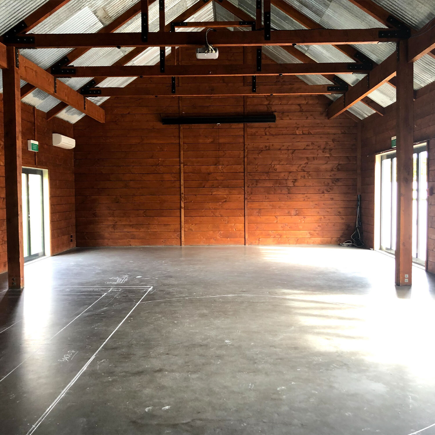
To completely renovate the interior and courtyard area and transform this previous wedding venue into a social and multi functional hospitality space, with a sophisticated fit-out.
THE PROCESS
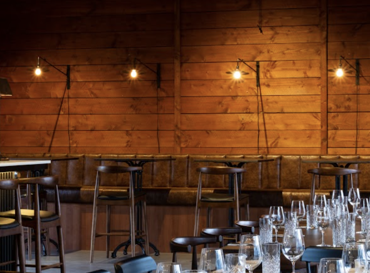
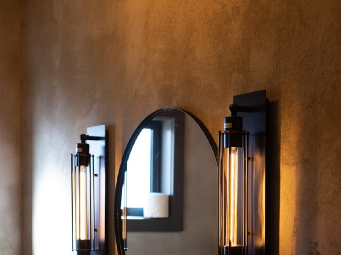
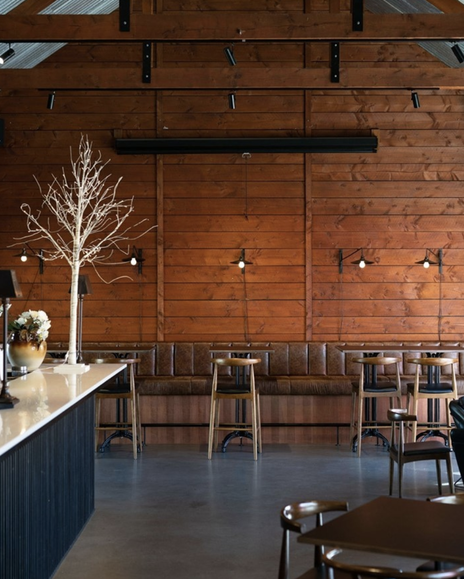
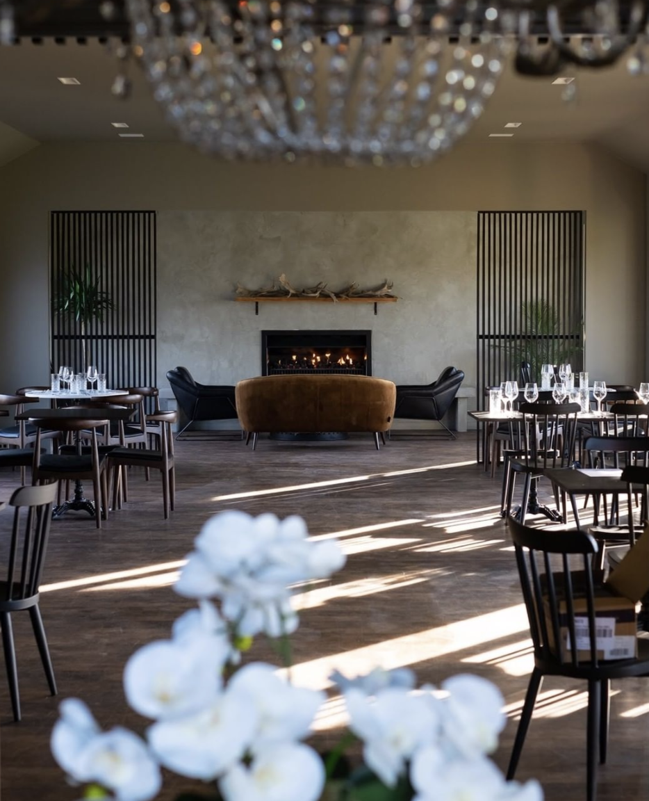
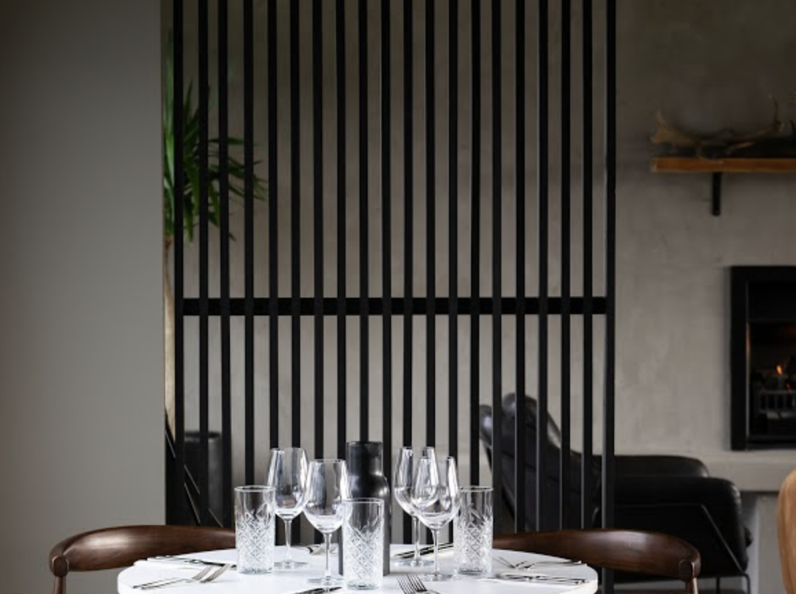
Due to the expanse of space, it was vital to maximise each nook and corner into a customised yet catered social hub, inclusive of private dining rooms, open restaurant layout, and tailor-made cocktail bar. This meant incorporating modern, sophisticated and rustic accents into the fit out- with natural wooden furniture, iron fittings, and leather and velvet booths, elements of subtle texture made this space feel cohesive, and comforting - without being overwhelming, as the neutral palette ensured multi purpose use as both a venue and restaurant.
THE OUTCOME
By staying true to the local Southern Otago region, accents of rust, concrete and wood were brought into to a modern and sophisticated application of styling to ensure each space felt truly genuine to its surrounding. Elements of leather and velvet added to the lush feel of the space, while also bringing a sense of warmth into the vastness of the interior. Overall, each space was catered to to encourage a relaxed and sophisticated bistro atmosphere.

Alchemy | Wanaka
THE BRIEF
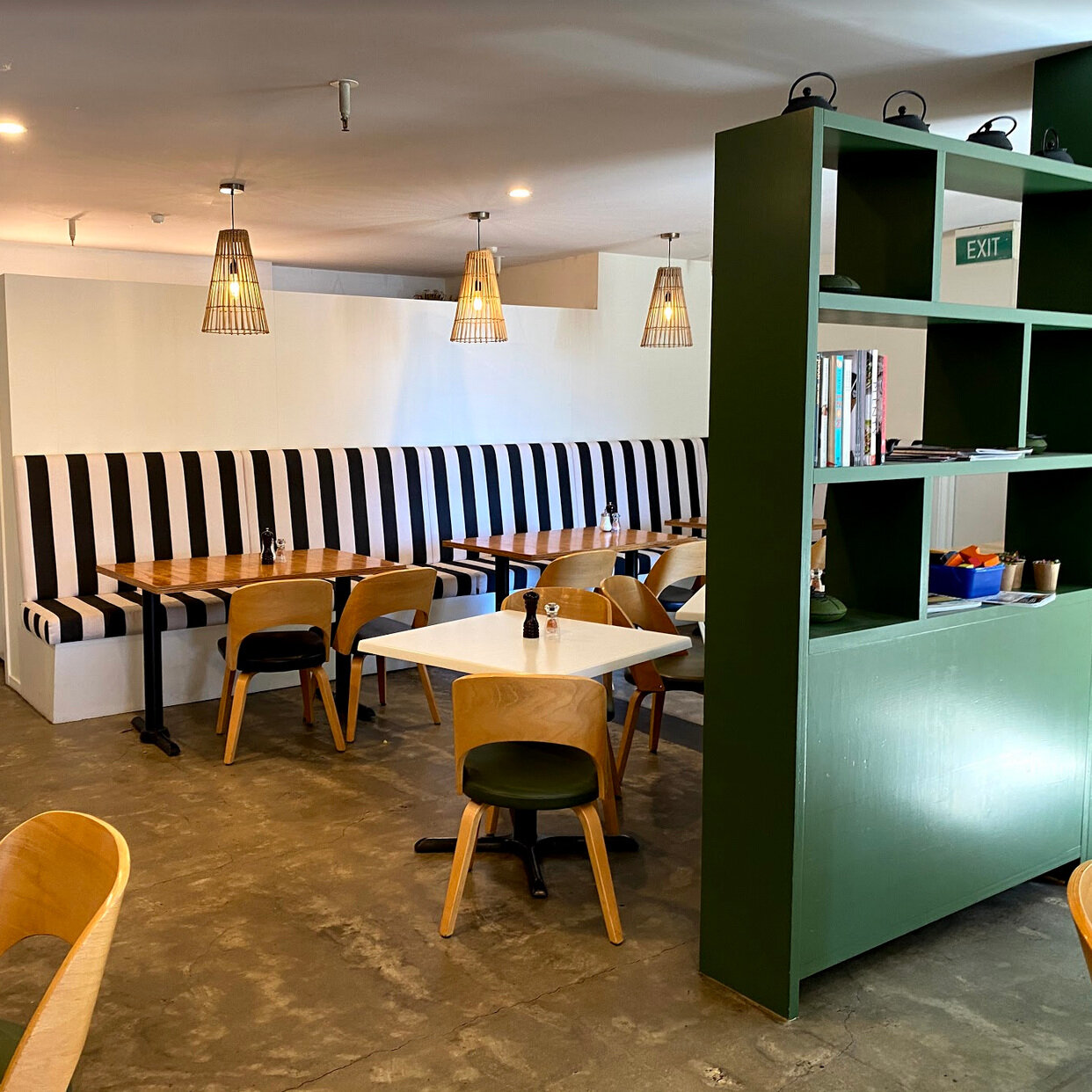
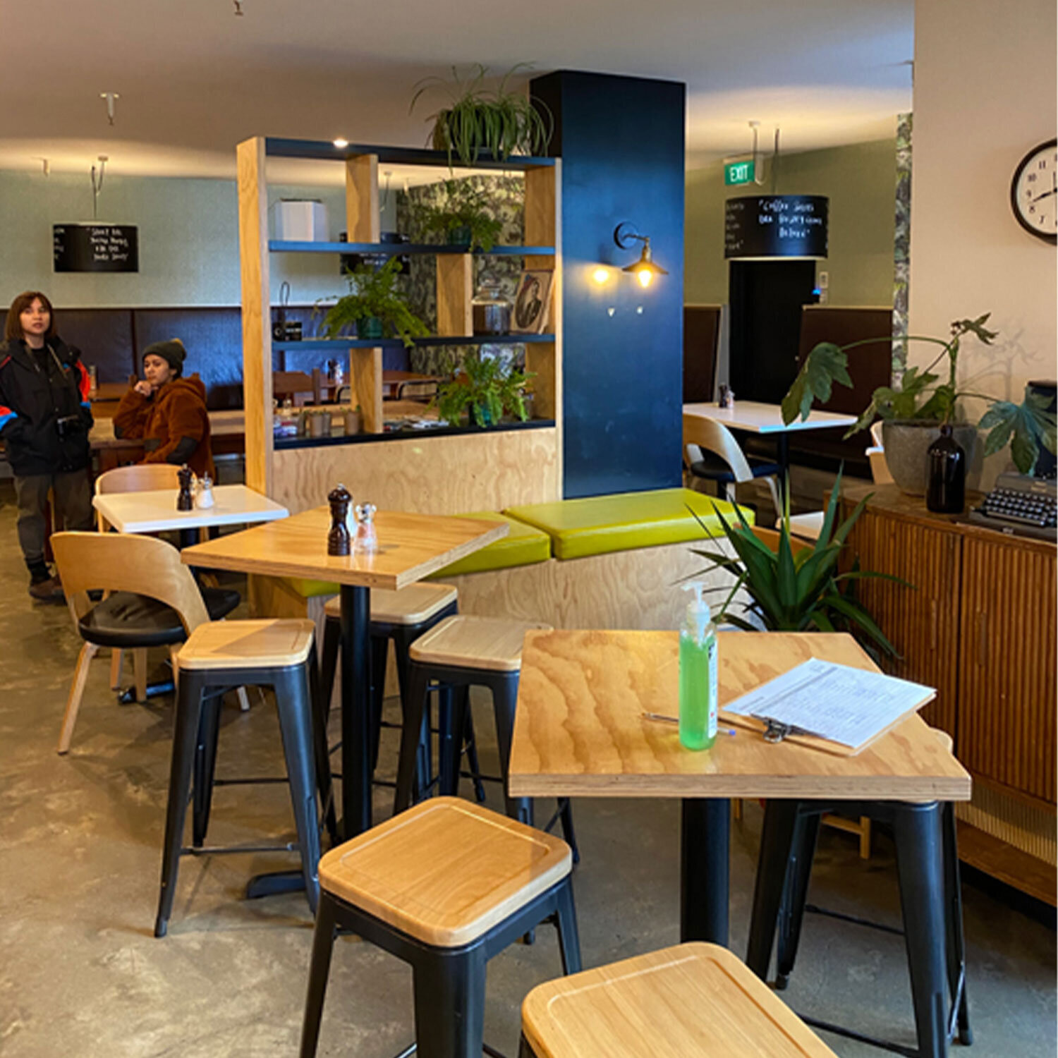
To create a whole new look and feel using the client’s existing fit-out and framework. the timeframe was limited due to trading functionality, with the requirement of being fully operational under a few weeks.
THE PROCESS
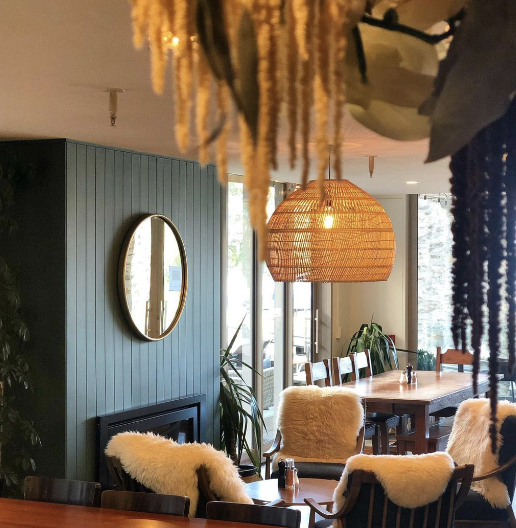
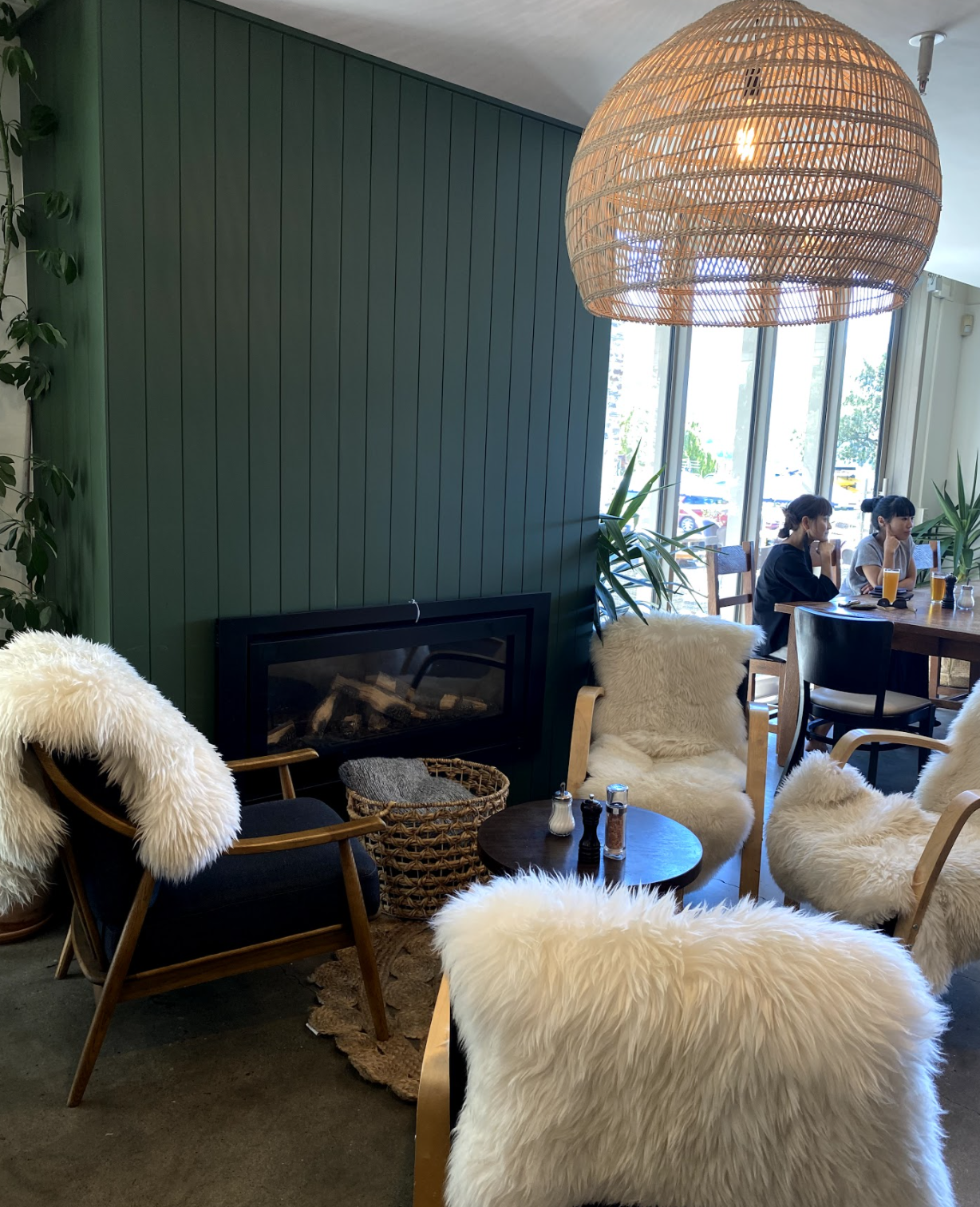
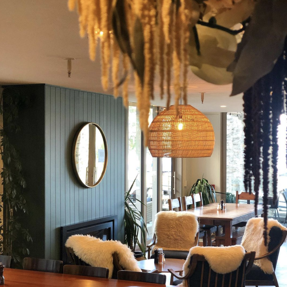
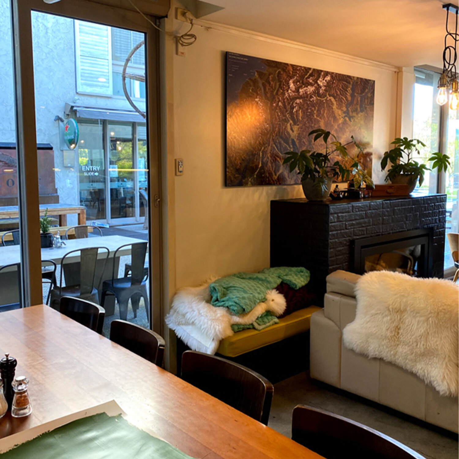
We worked with a earthy green colour scheme to add in accents of brass finishings, and integration of bolder patterns across reupholstered squabs, chairs and existing tables. We also framed the front window area with black sheer curtains to allow for privacy and light filtering throughout the day, without obstructing those spectacular lake views.
THE OUTCOME
We were able to refresh the existing interior using complimentary colour enhancements and patterns, while being tactical on where to uplift and customise furniture to achieve a whole new cohesive feel - one that is inviting, fun and fresh. This lead to the development of a more functional, open space that catered to both daytime use as well as a cozy evening set up to drive foot traffic to the bar.
Lake Hawea Station | Hawea |
THE BRIEF
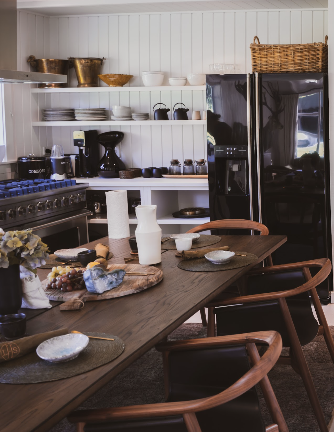
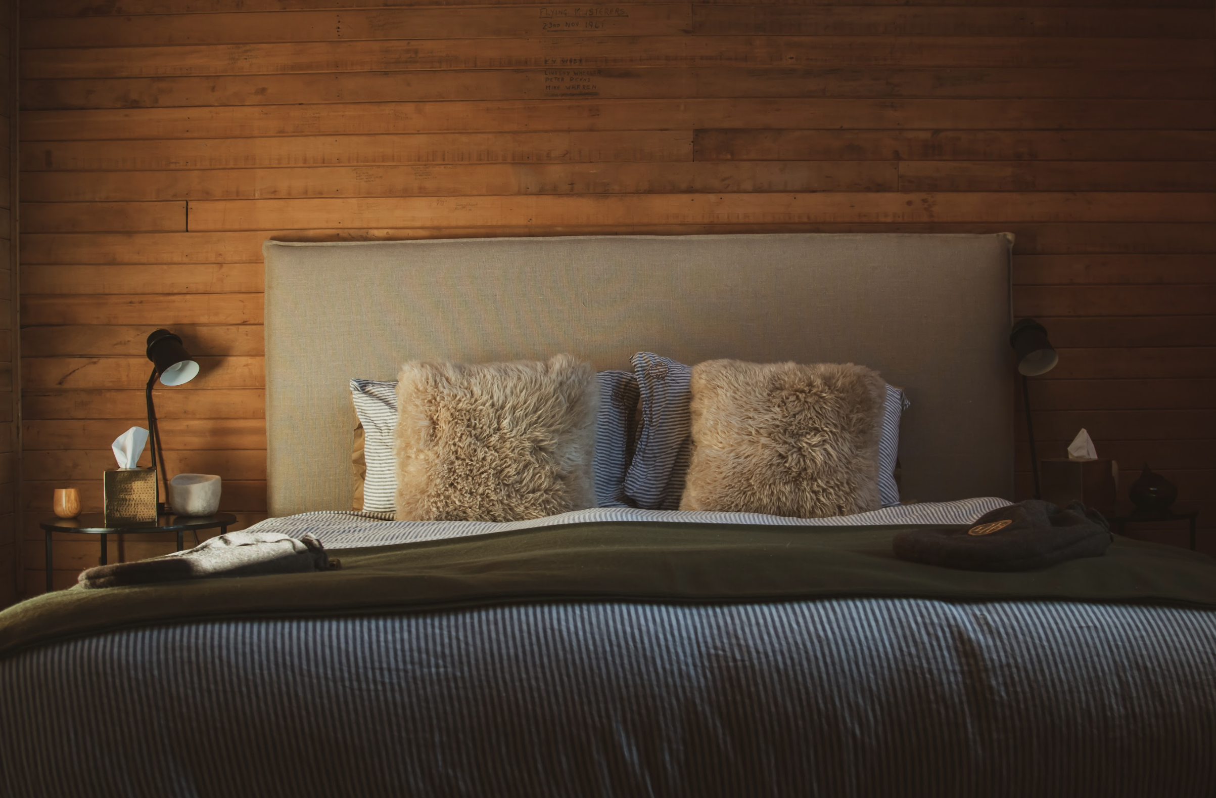
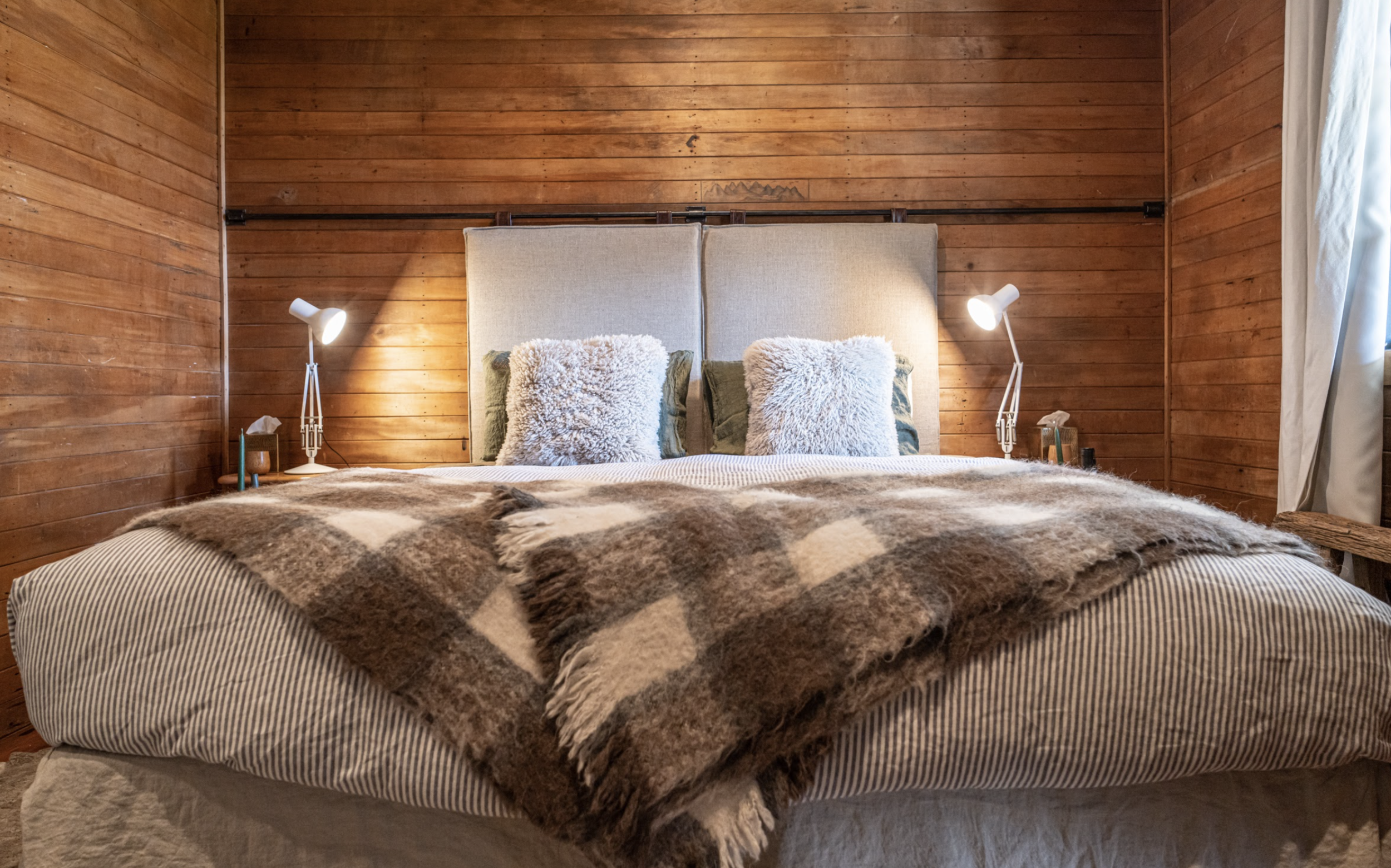
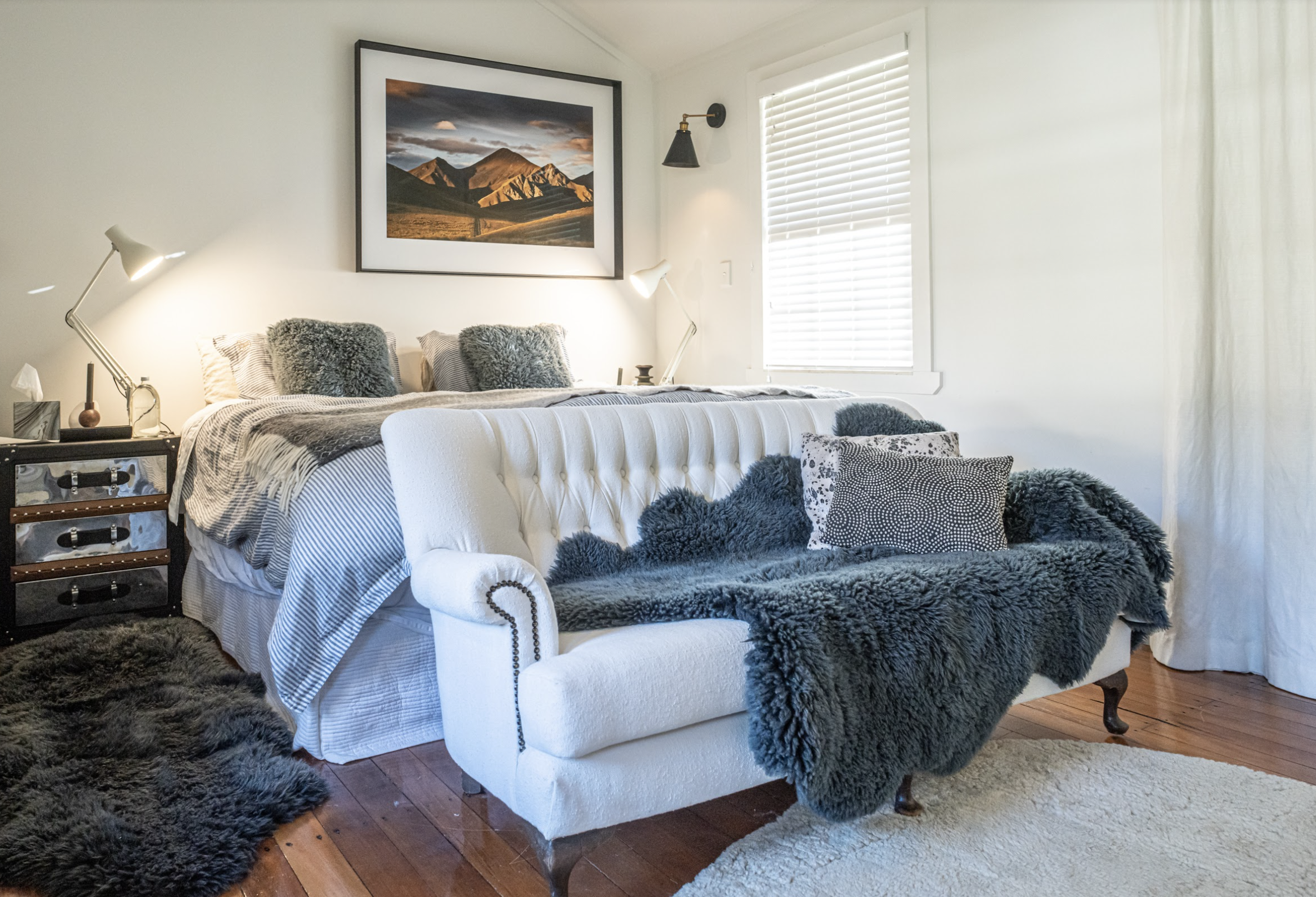
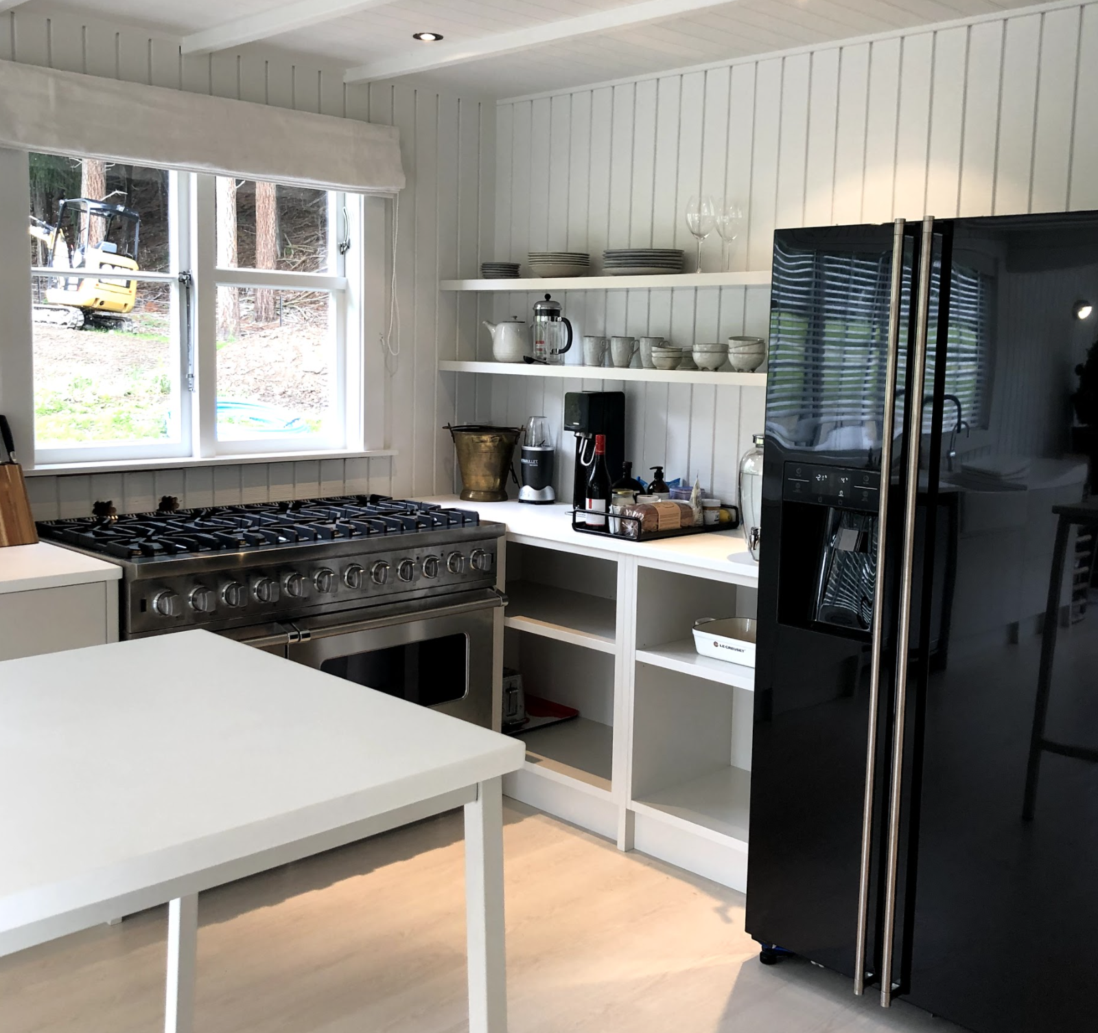
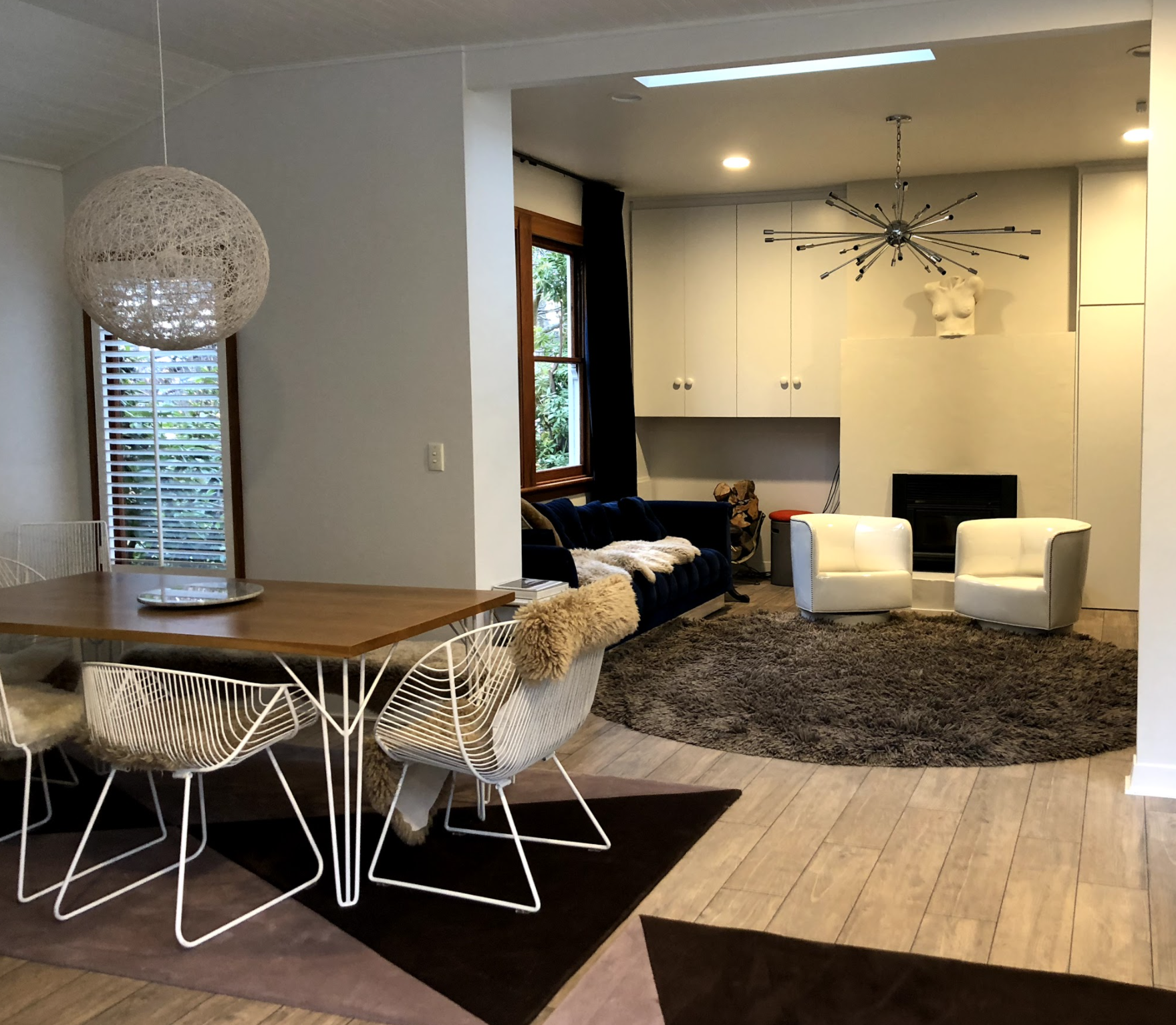
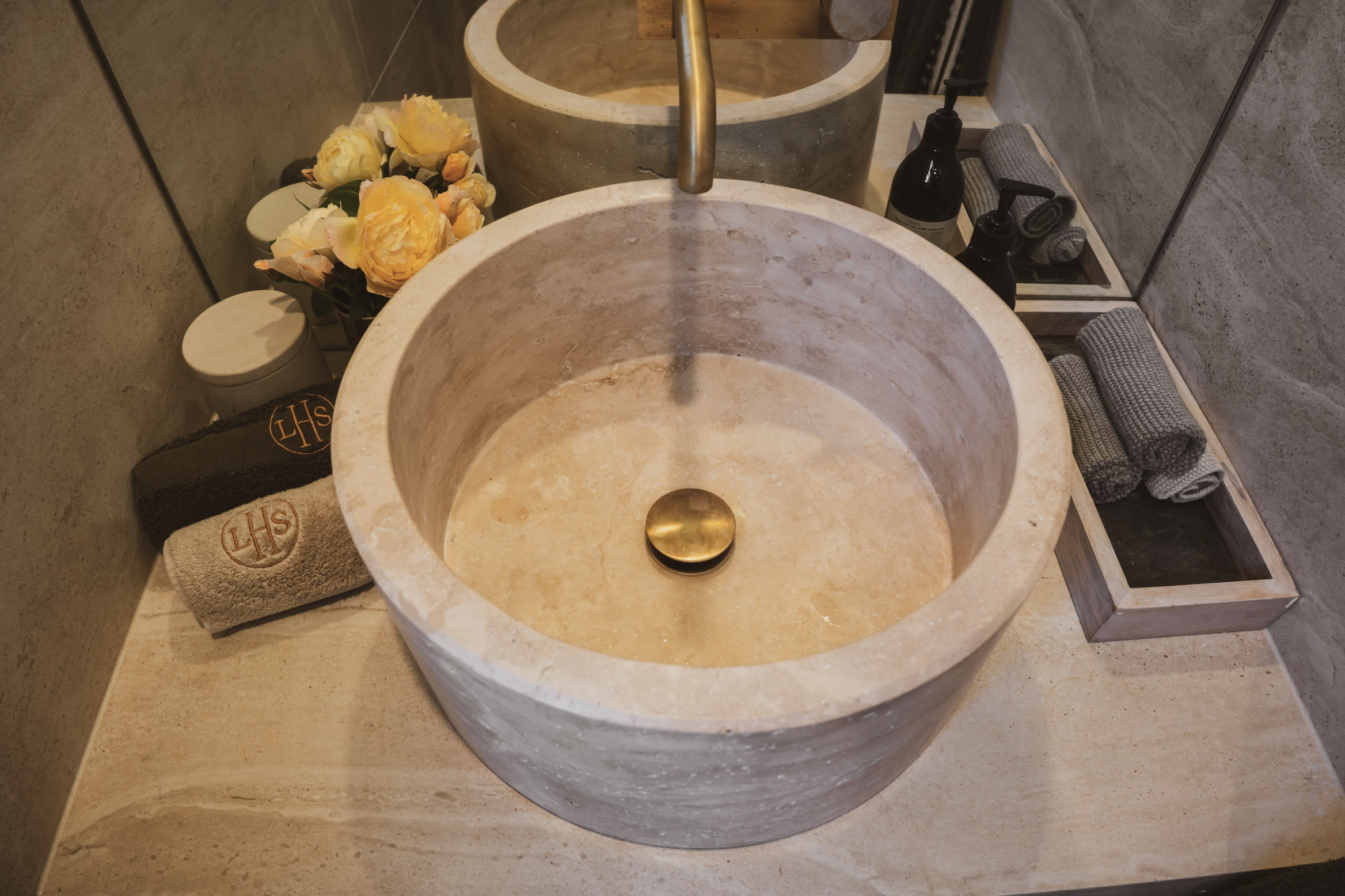
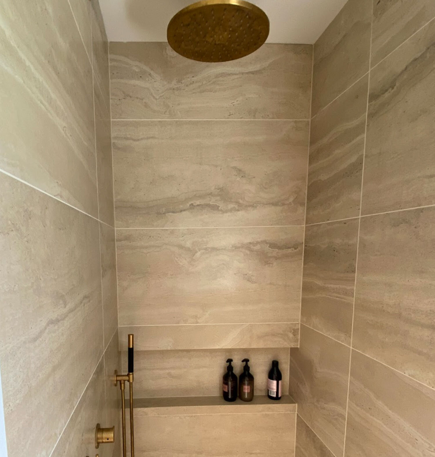
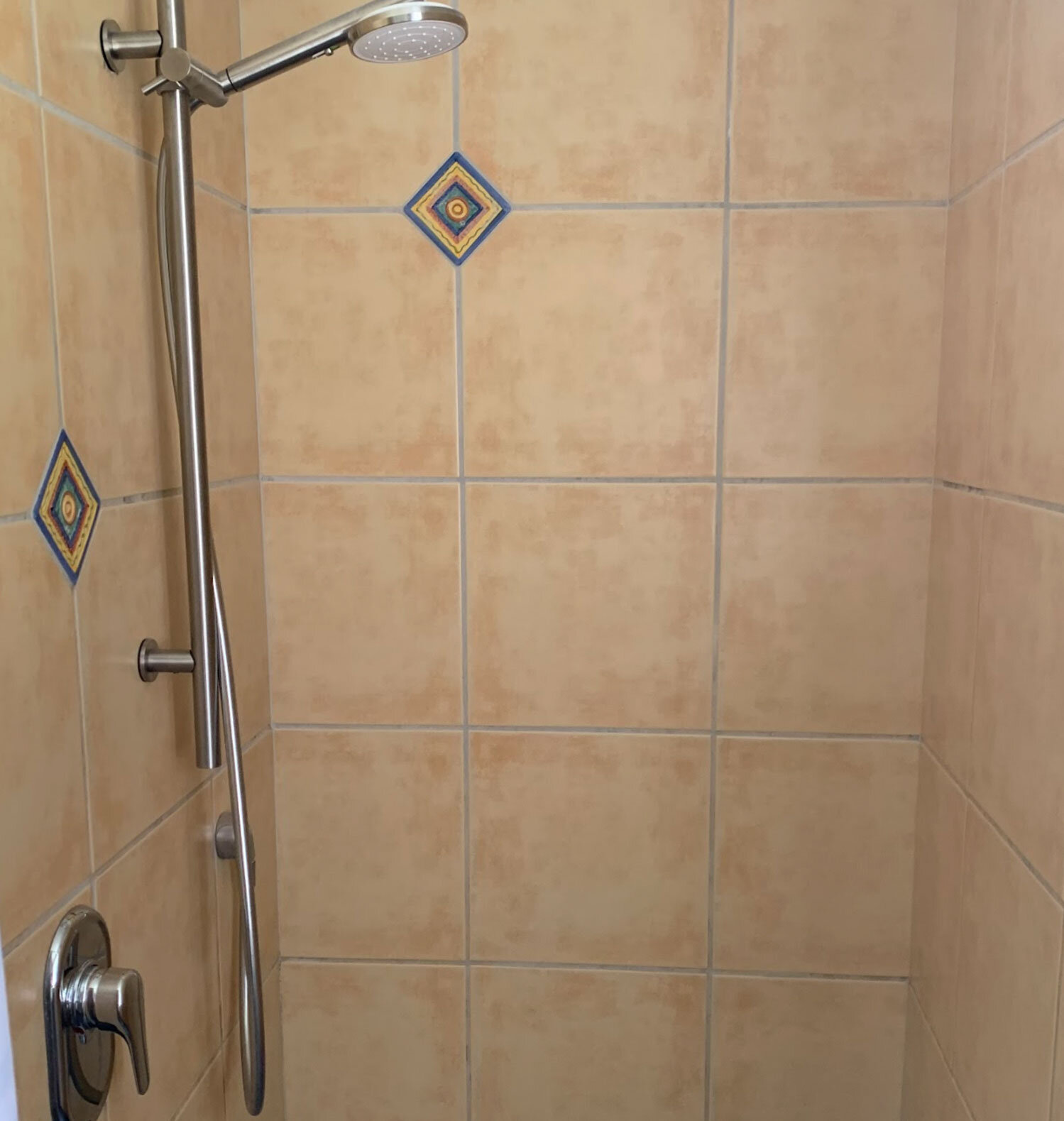
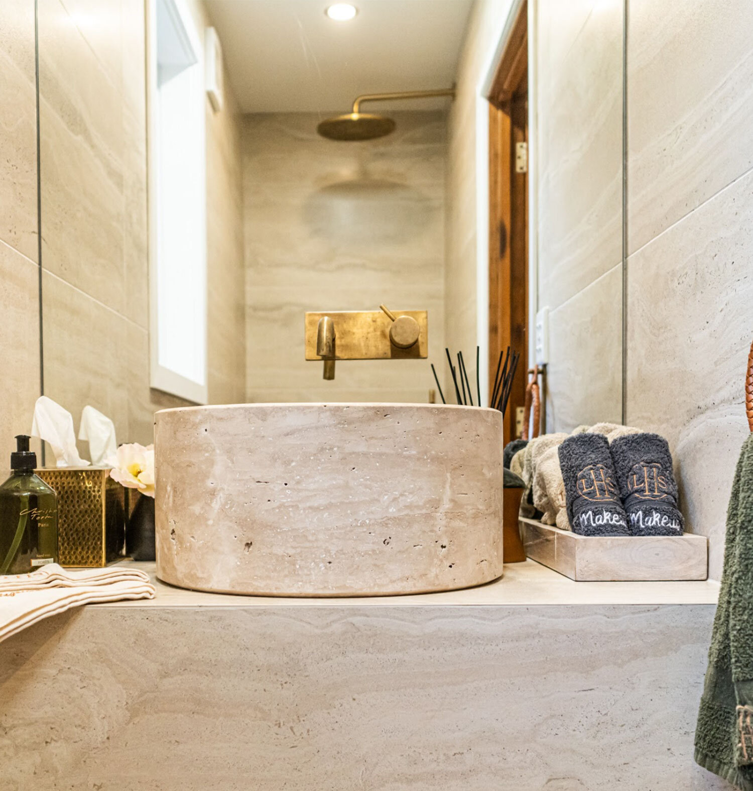
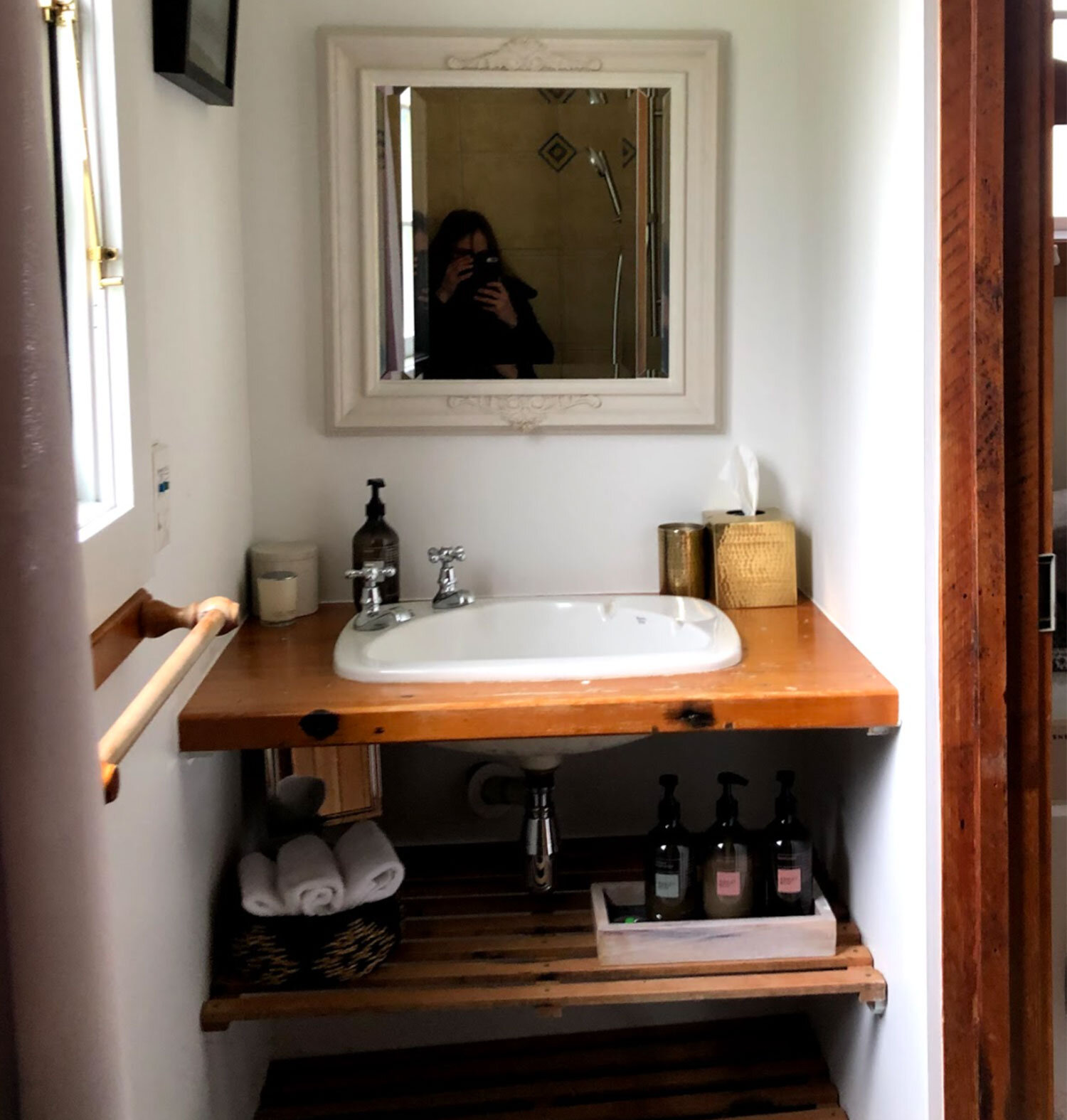
To conscientiously renovate the old shepherds huts; Packhorse and Homespur Cottage, by keeping in mind the heritage and character of both spaces, while integrating modern comforts.
THE PROCESS
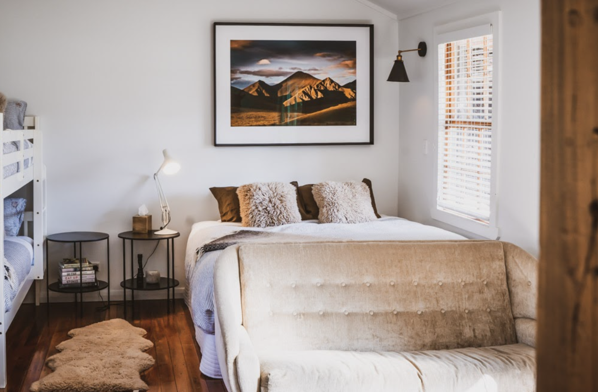
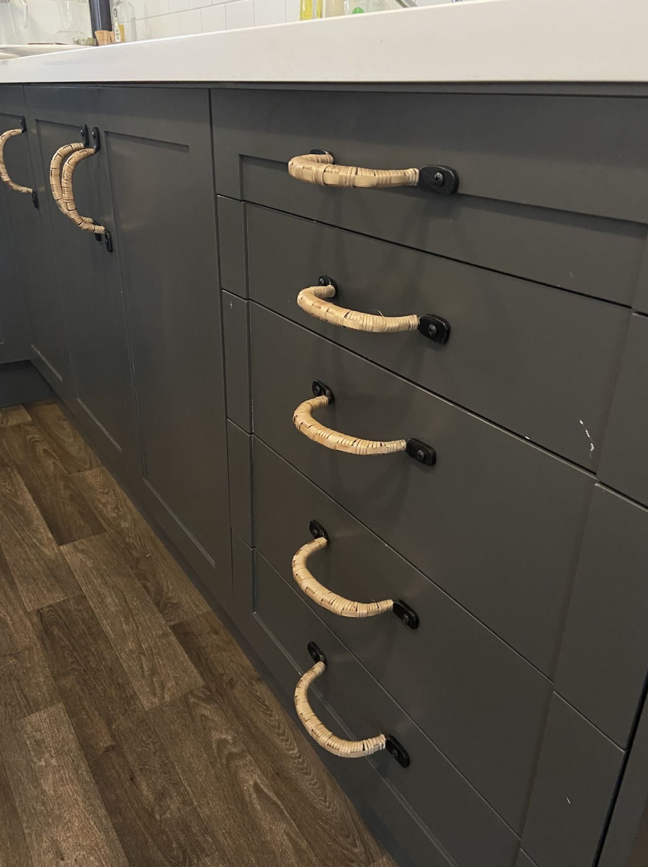
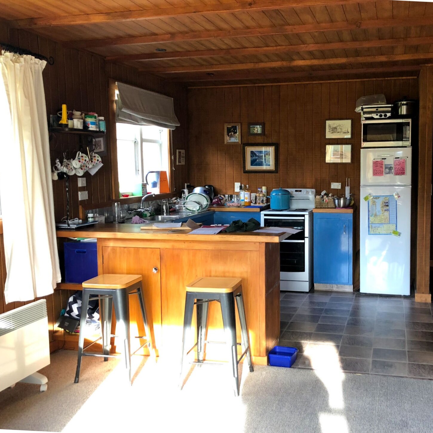
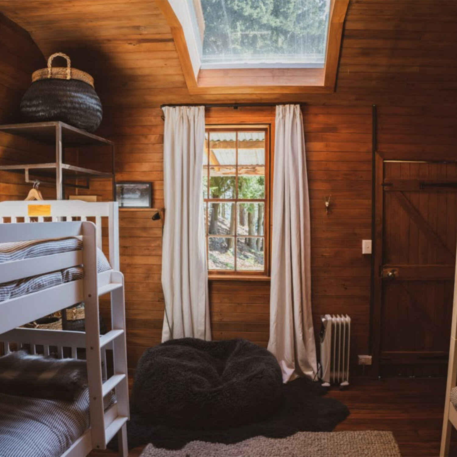
Initially, the idea was to renovate and update each cottage into a practical space for the workers on Hawea Station. However, as the process developed this lead to a complete overhaul of the original shearers quarters and working huts. These spaces soon transformed into accommodation for future guests. Each hut was carefully customised, working around the original features of the space ( shearers drawings on the wall etc.) to bring together a modern yet lodge-based aesthetic. Renovations included a whole new kitchen design and fit out, updated flooring, bedding and furniture with practical window solutions to create a cozy and inviting space.
THE OUTCOME
From the outset it was clear we wanted to work with the history of the build, then against it. By bringing in fresh furniture and amenities that lifted and redesigned the flow of each space, we still maintained the charm of the wooden, iron and steel accents within the original interior. By bringing in varieties of texture and comfort, we were able to achieve both a functional and luxurious finish, with the overall purpose of bringing people together to enjoy the landscape of the Southern Otago station.


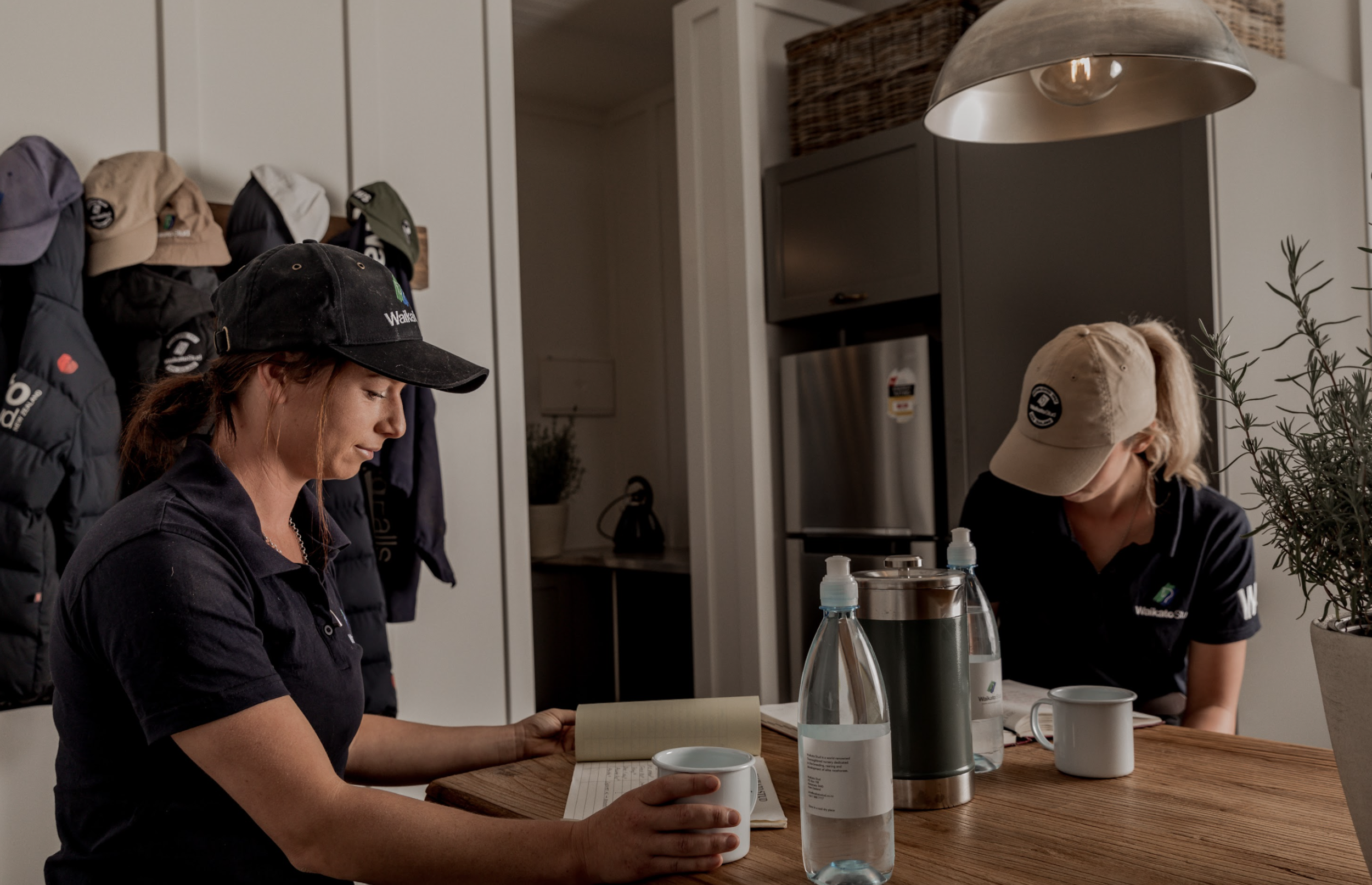
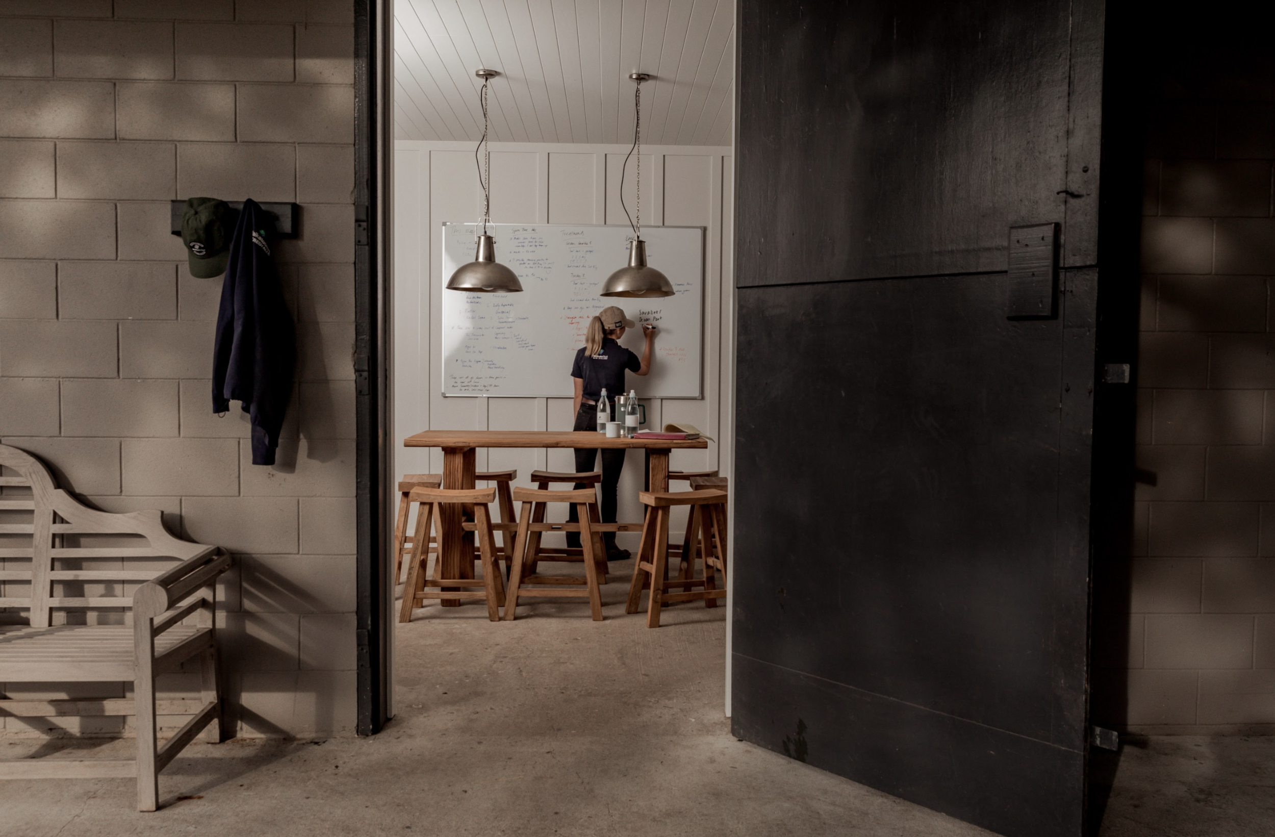
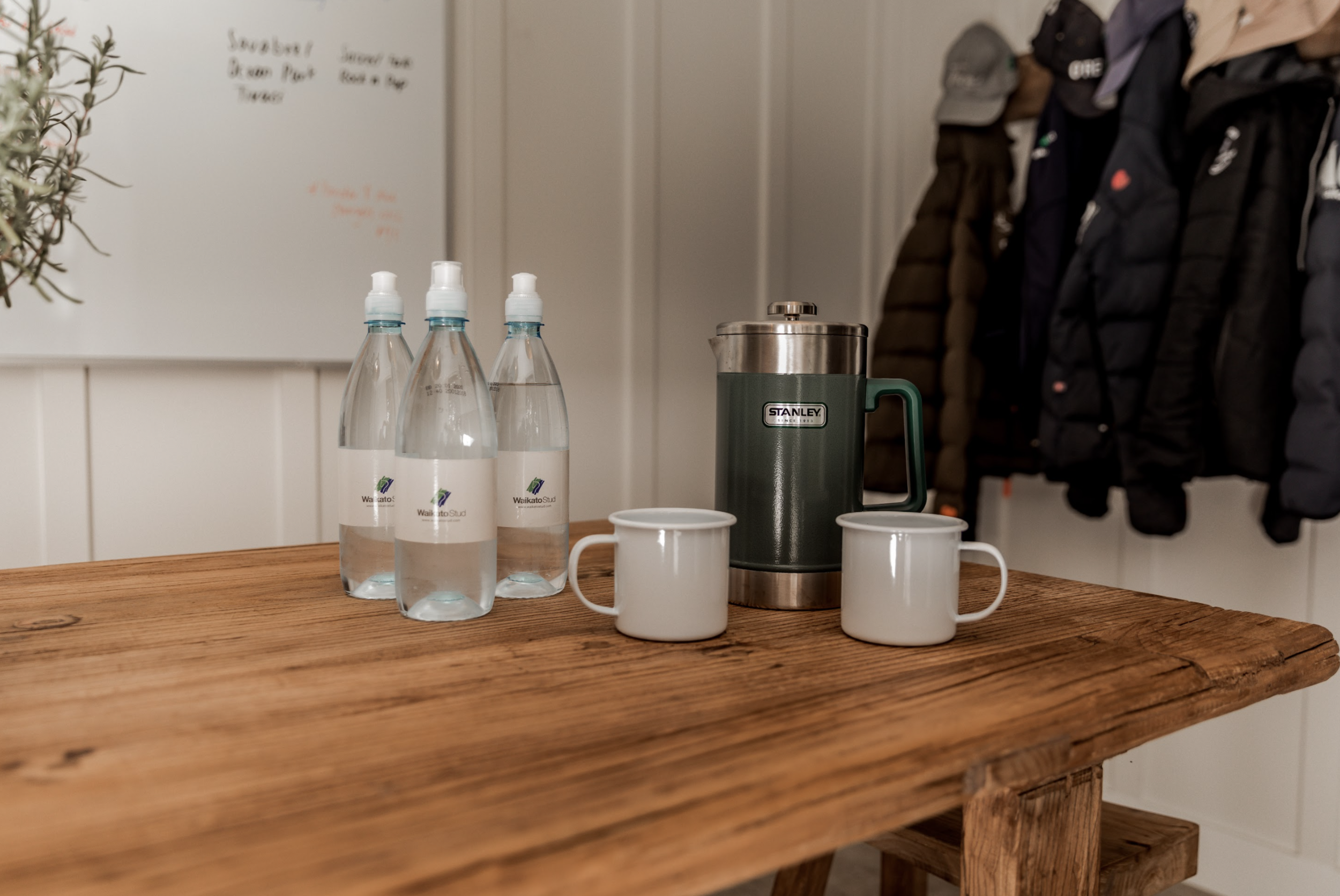
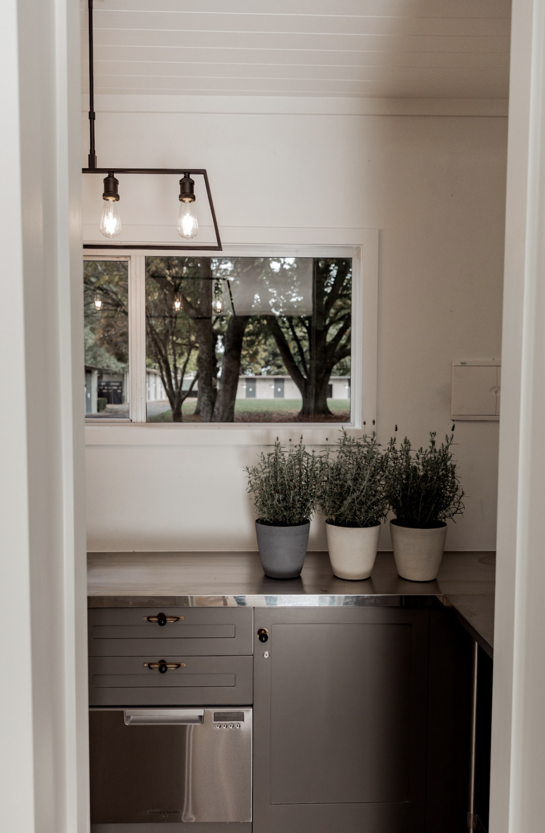
‘Yearling Yard’ | Waikato Stud | Commercial | Mata Mata |
THE BRIEF
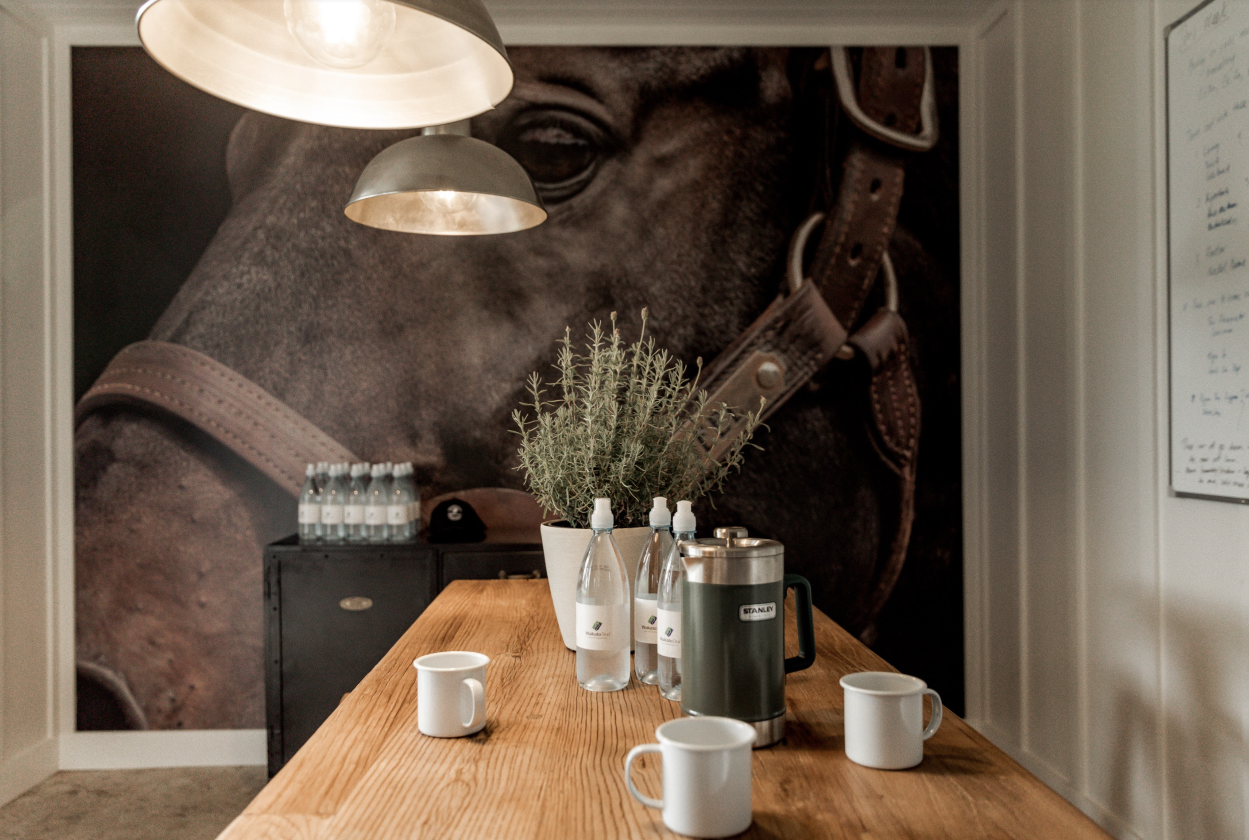
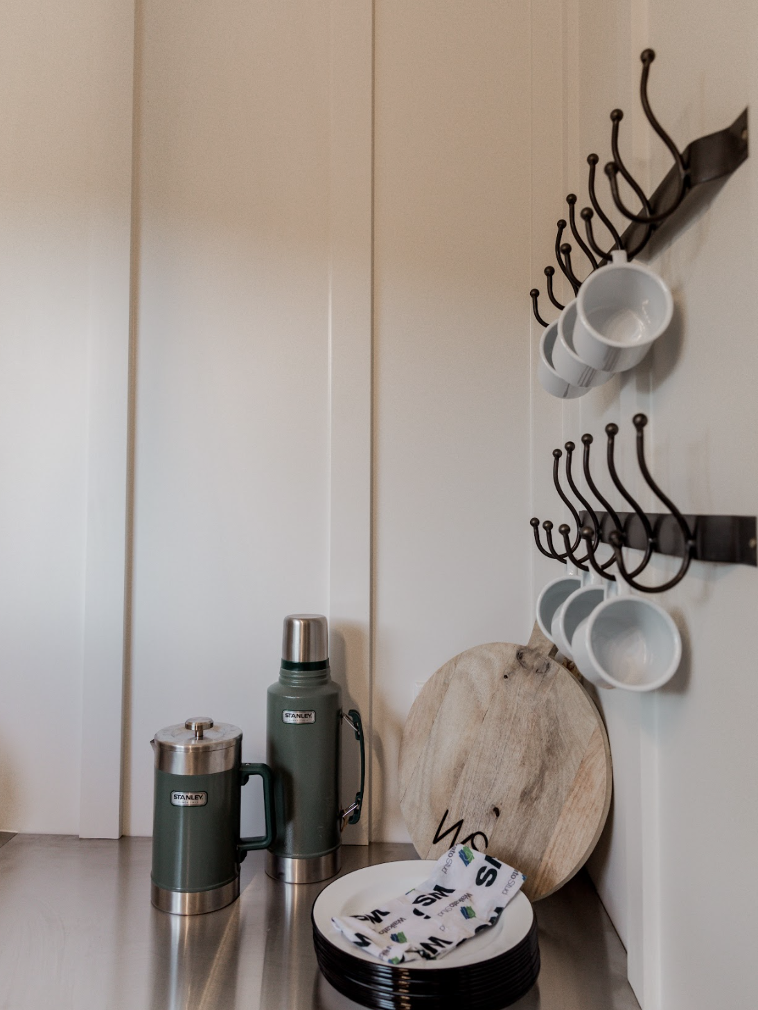
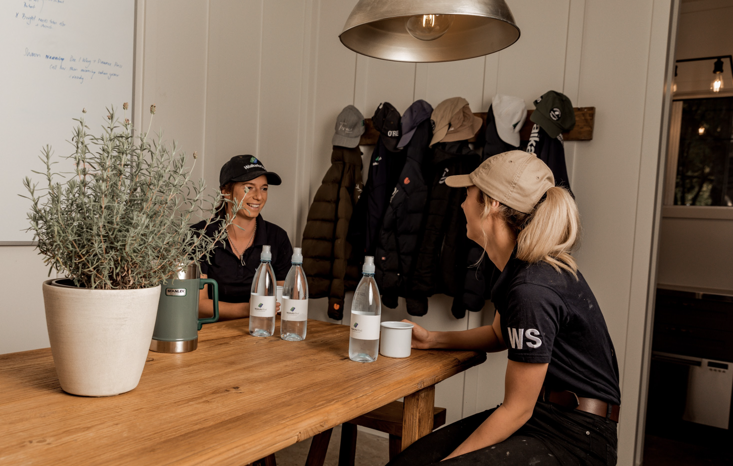
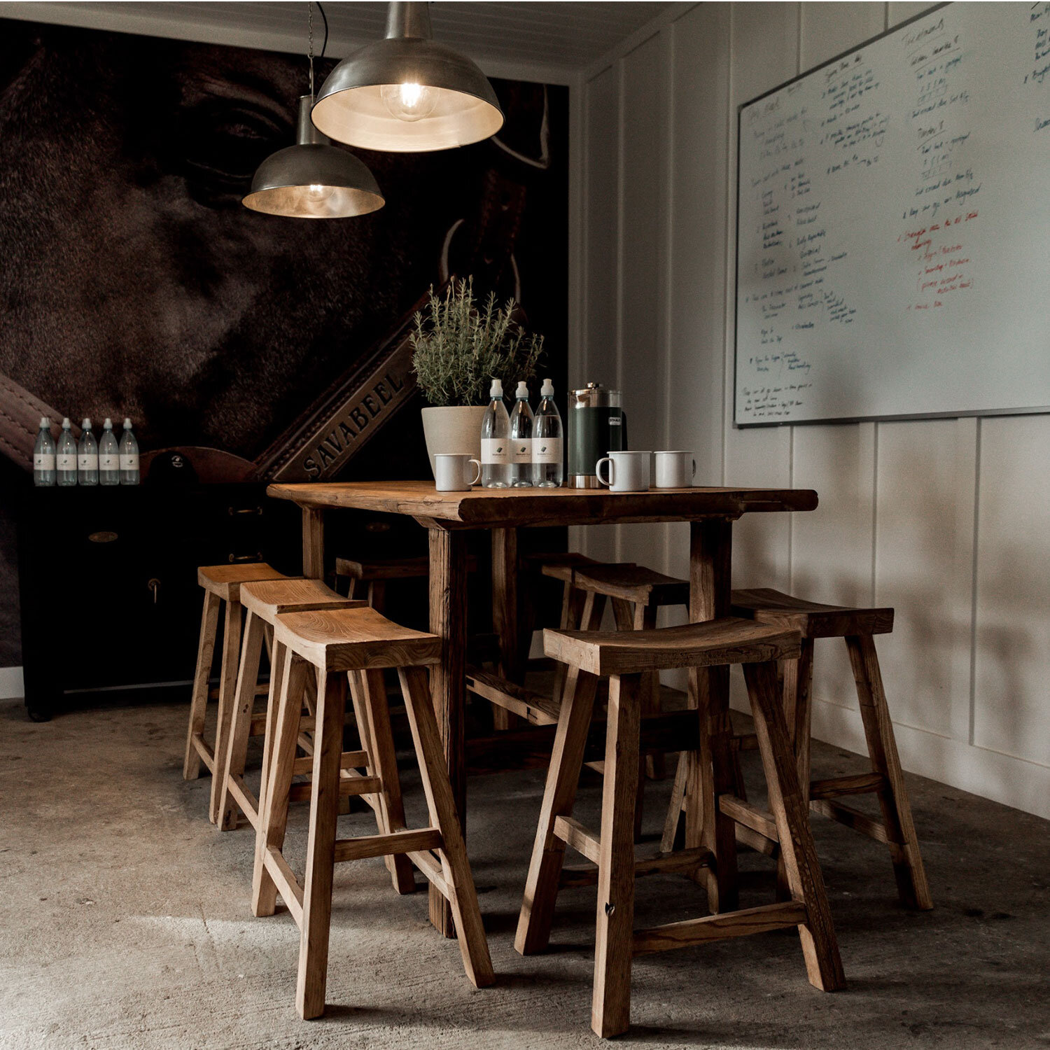
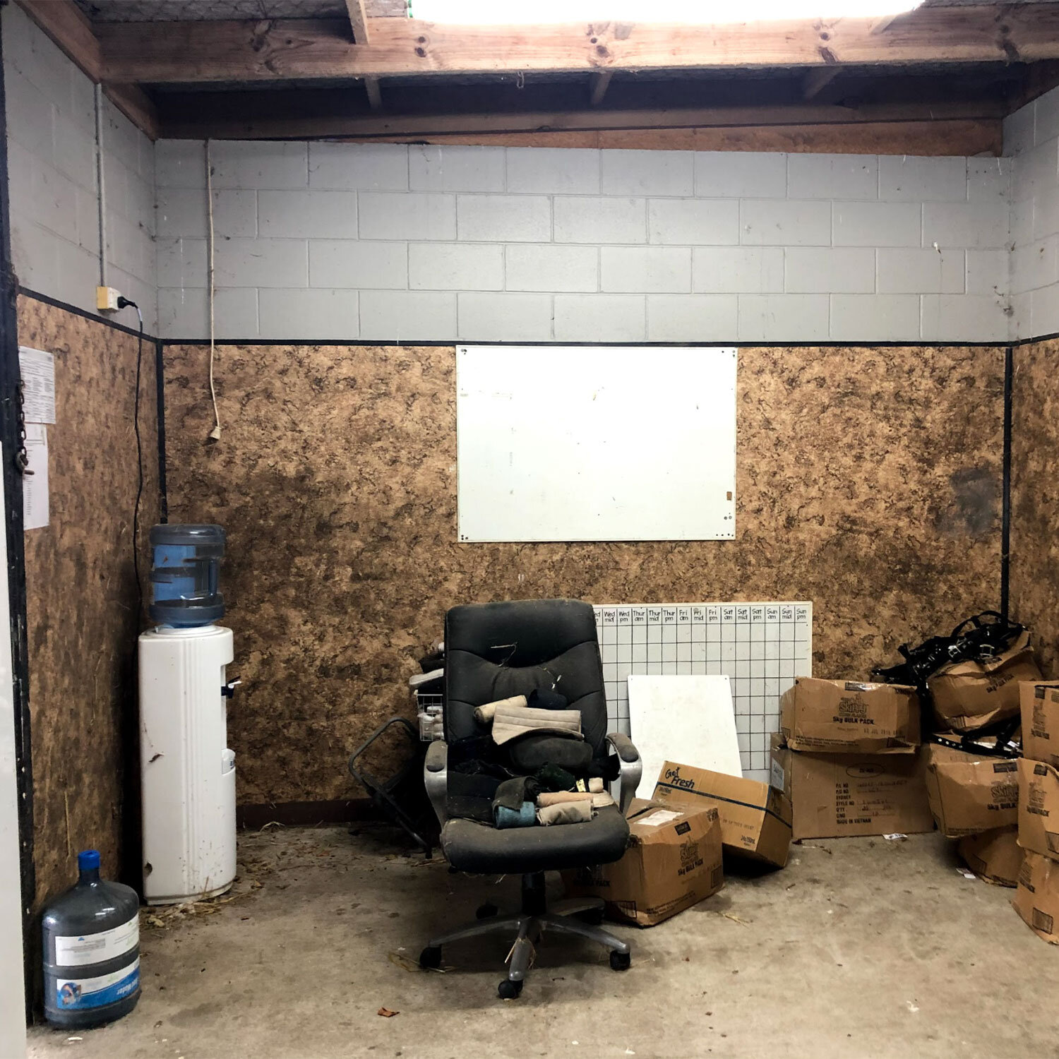
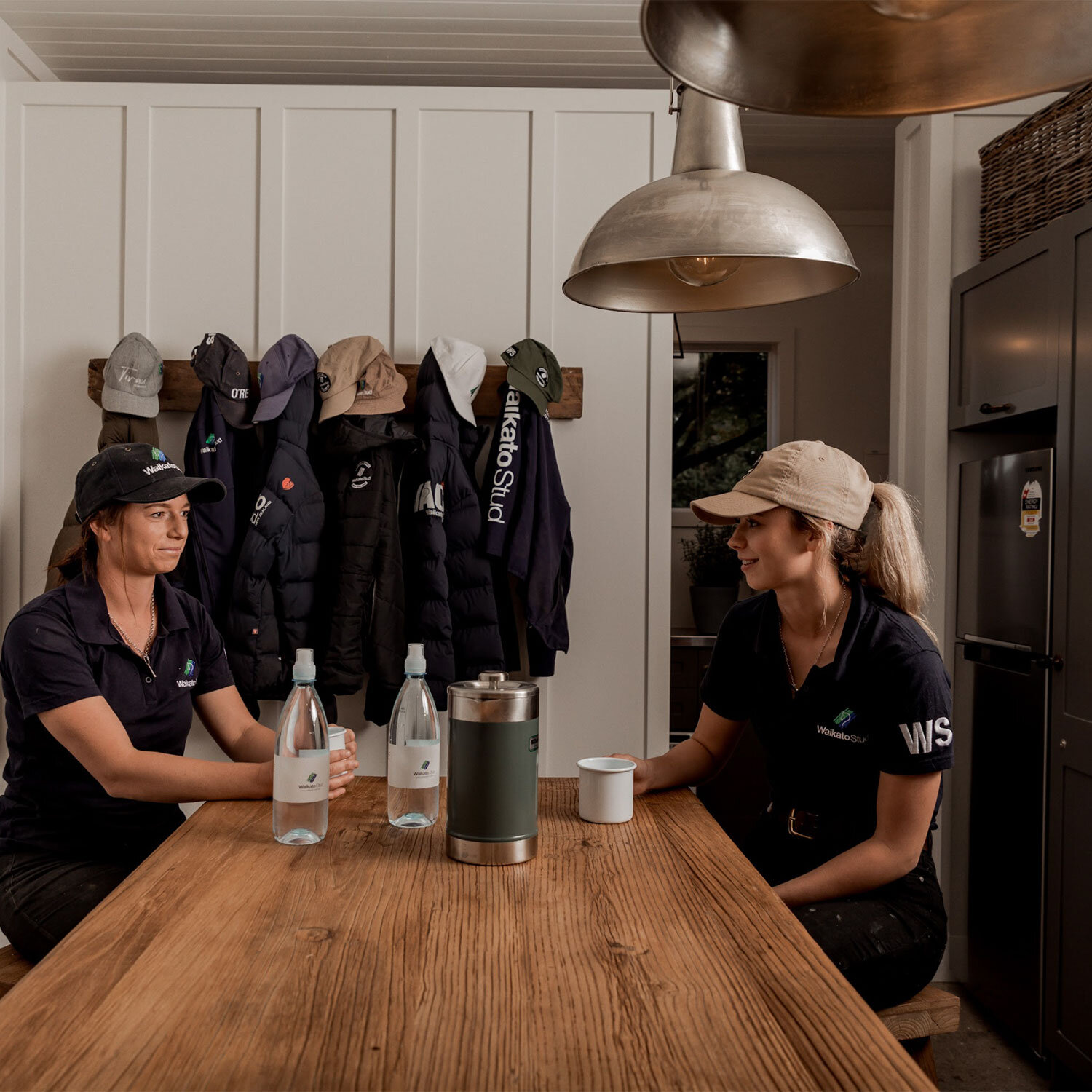
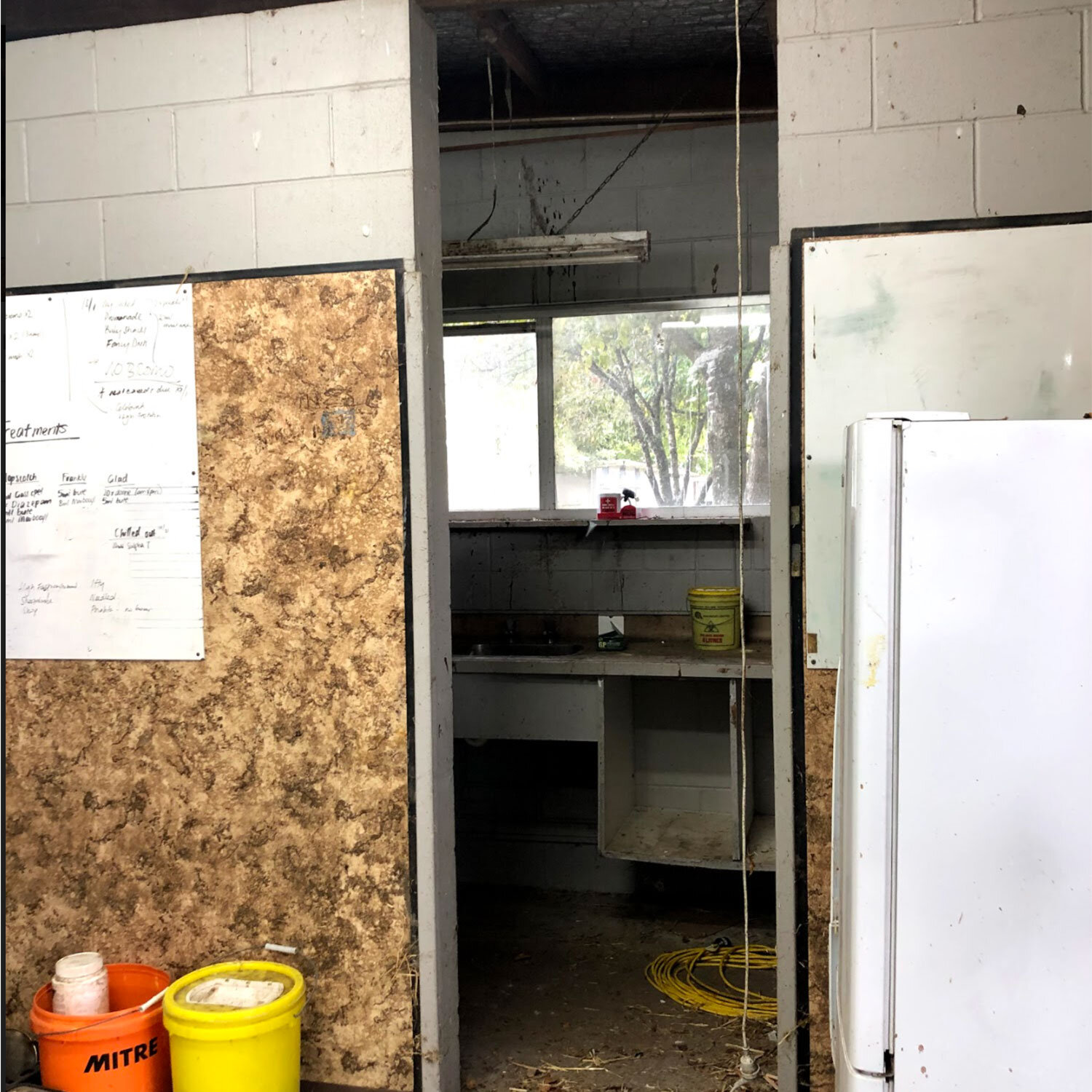
To transform a yearling stable into a communal hangout and entertainment space for the guests and workers. Blending together a practical solution with a rustic yet high-end finish.
THE PROCESS
Aligning with the natural ethos of the business, we looked to turn this shed into a modern functional space with an organic feel, that was able to cater to the majority of users. Working collaboratively with the client we undertook an entire fit out - complete with updated amenities, kitchen layout, wooden flooring and furnishings. The key was to develop an open design despite the restricted space - using a combination of dark earthy finishings to contrast with light walls and flooring.
THE OUTCOME
The client’s vision to create an organic and practical space with a sophisticated design was accomplished. Working with neutral tones and natural fibres to cohesively reflect both the brand and environment, we created a hub that was both inviting and enticing for guests and workers to utilise.
Kota Restaurant | Wanaka
THE BRIEF
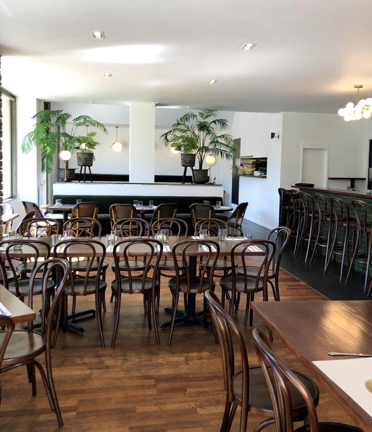
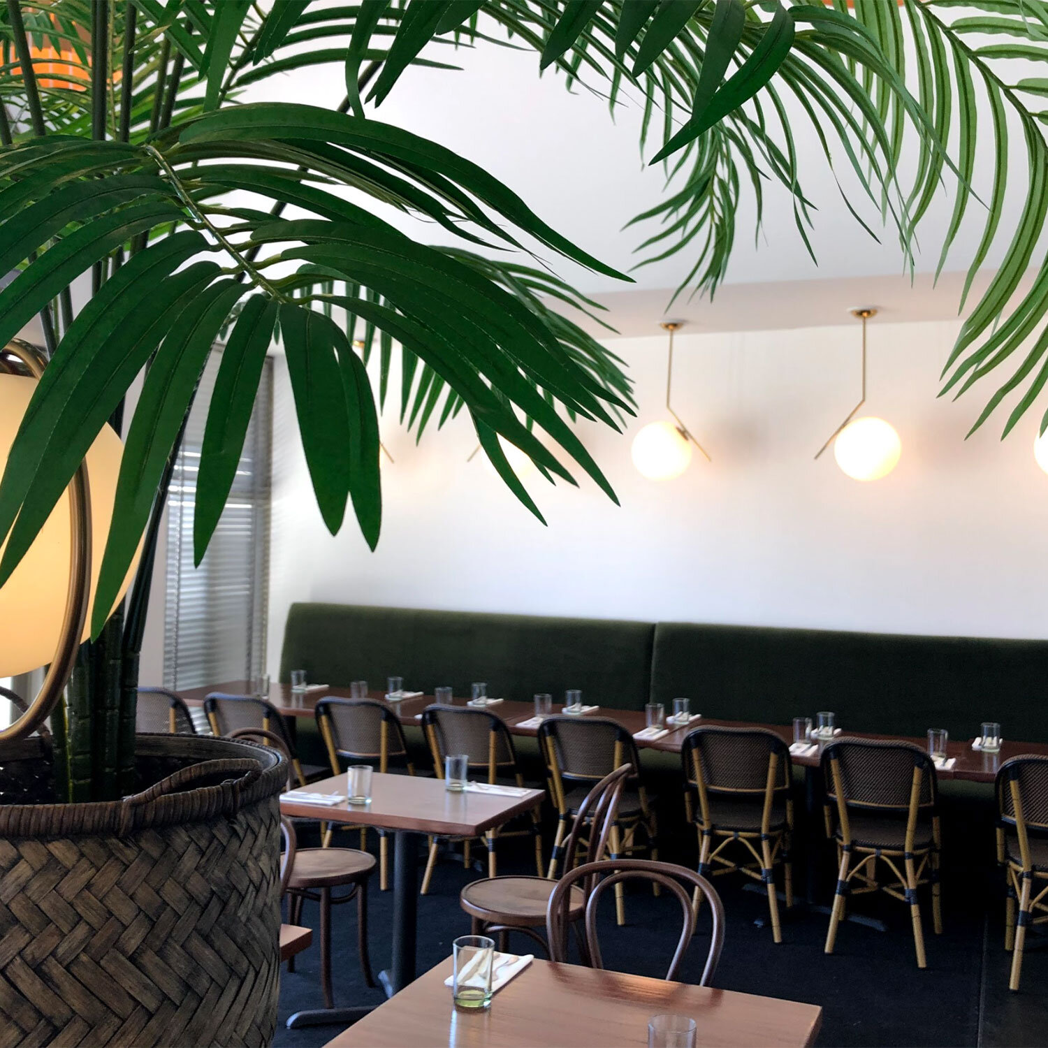
To completely redesign the interior of the restaurant into a functional, urban and relaxed environment, with a fresh, oasis-inspired modern lift and feel.
THE PROCESS
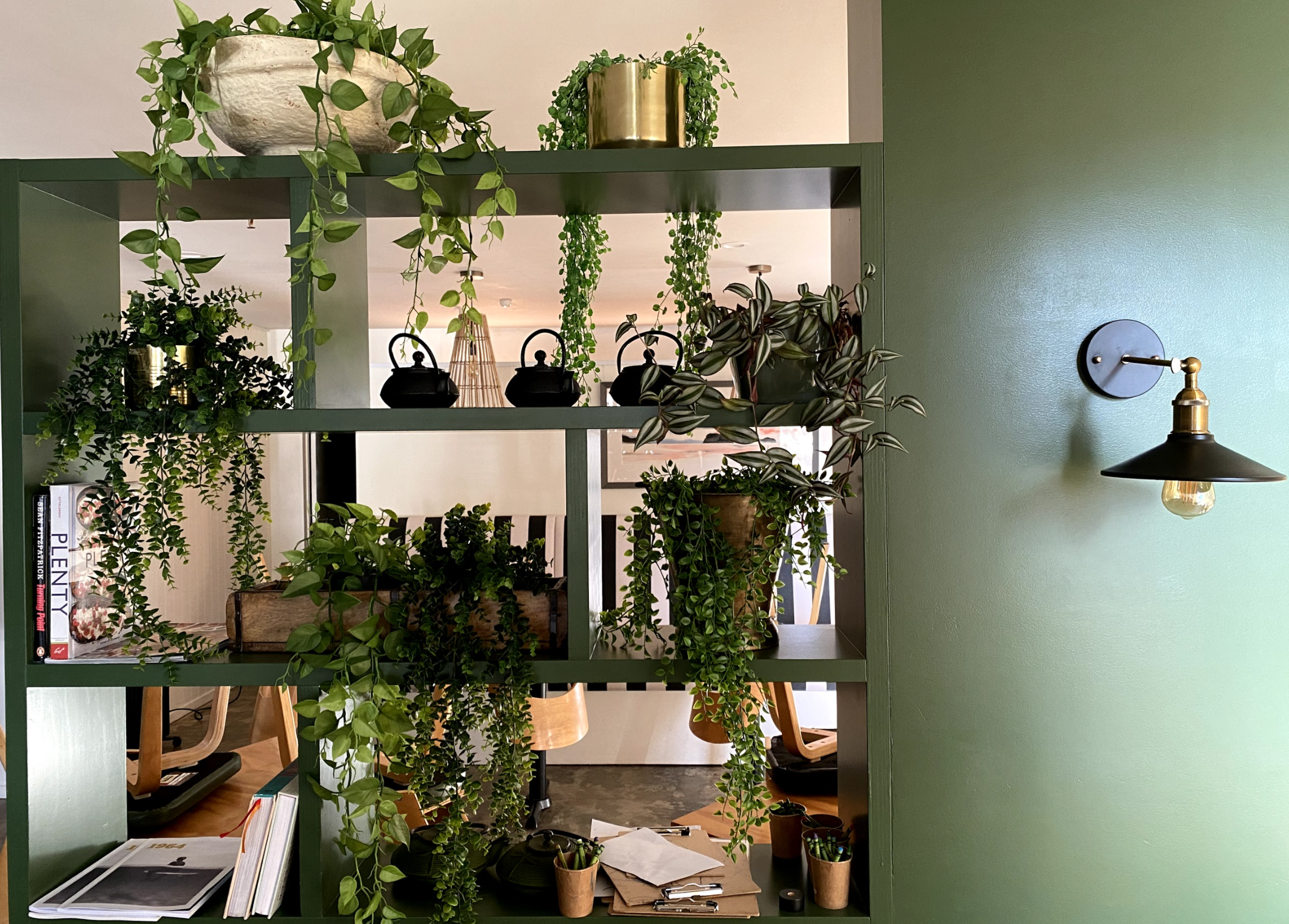
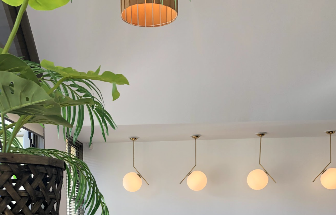
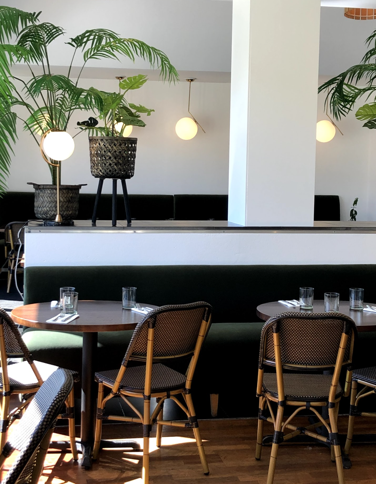
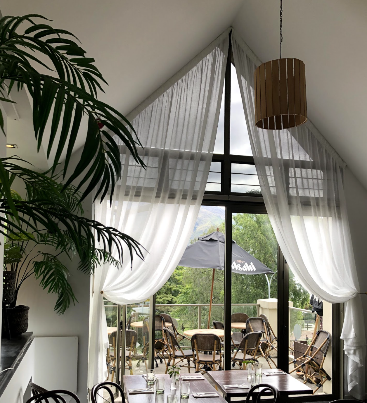
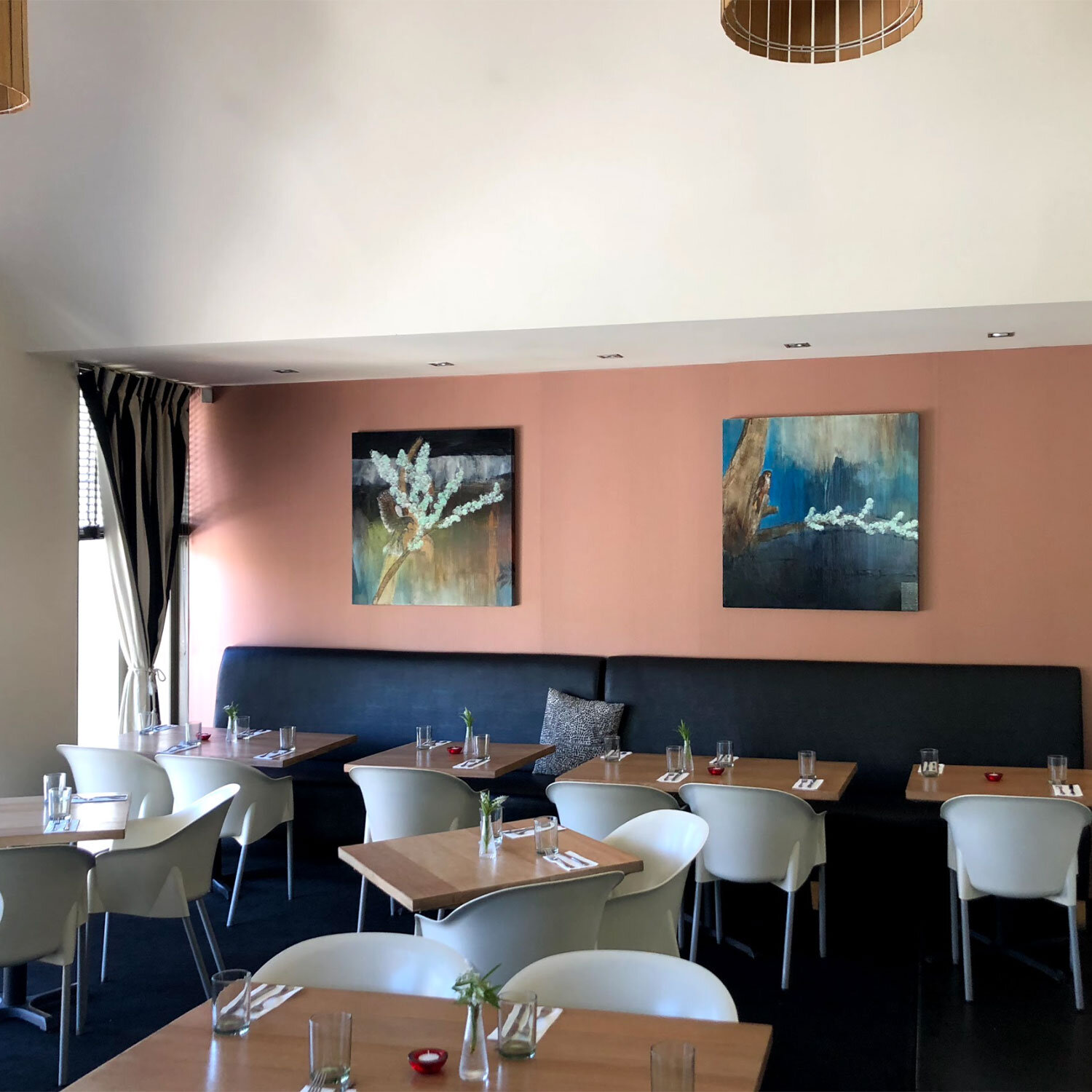
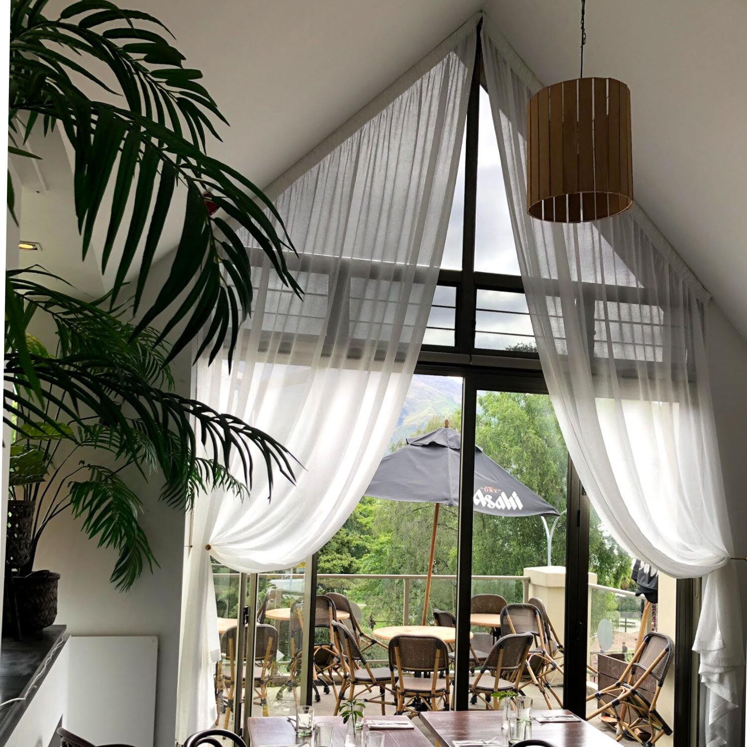
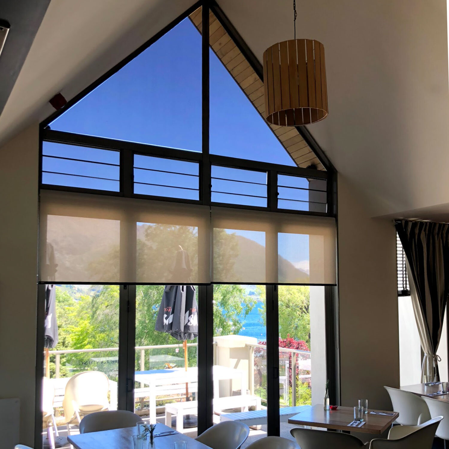
The owners wanted to create a space specifically catered towards the evening. Within a limited timeframe and budget, our intention was to invest in key features that would freshen the space- via new furniture and lighting, lighter wall colour, velvet textures and live plants to create a more energised environment. The soft drapery was a stylistic choice across a tricky angled window, yet worked perfectly to provide a sense of elegance, while at the same time framing the beautiful views of the lake and Wanaka township.
THE OUTCOME
Through modern and elegant touches across the finishings, windows, paint and furniture we were able to breathe a new sense of life into the existing restaurant. The space transformed into an inviting and uplifted dining experience, perfect for any social occasion.
The Spice Room | Wanaka
THE BRIEF
To rejuvenate and uplift an existing dining space, working with existing furnishings and a limited timeframe, to be accomplish a whole new look and feel.
THE PROCESS
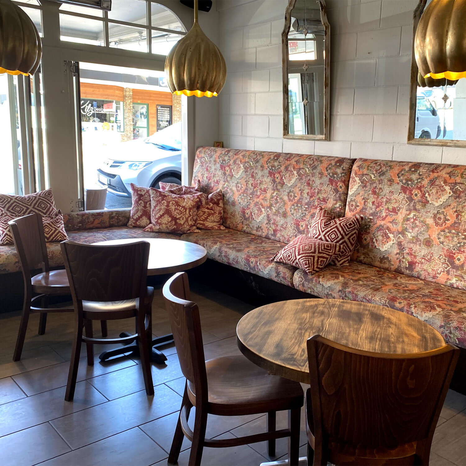
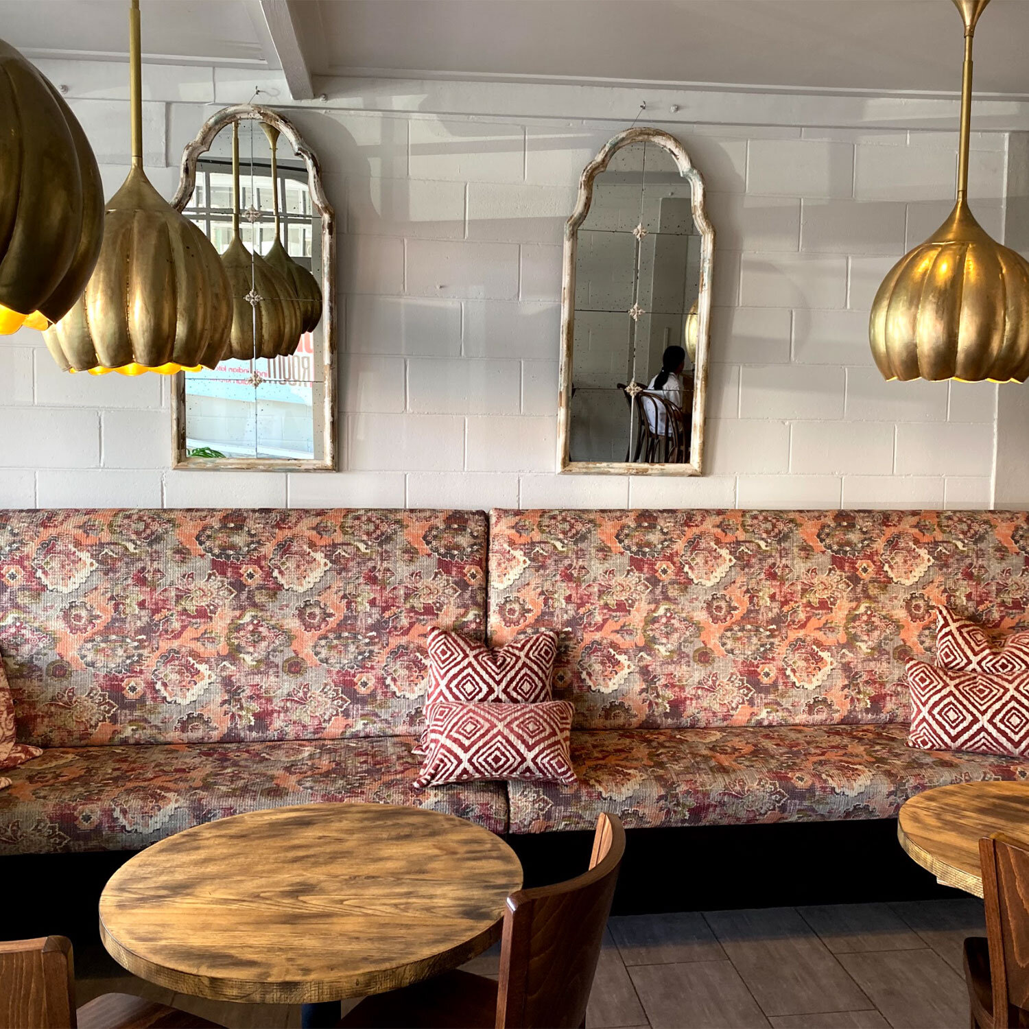
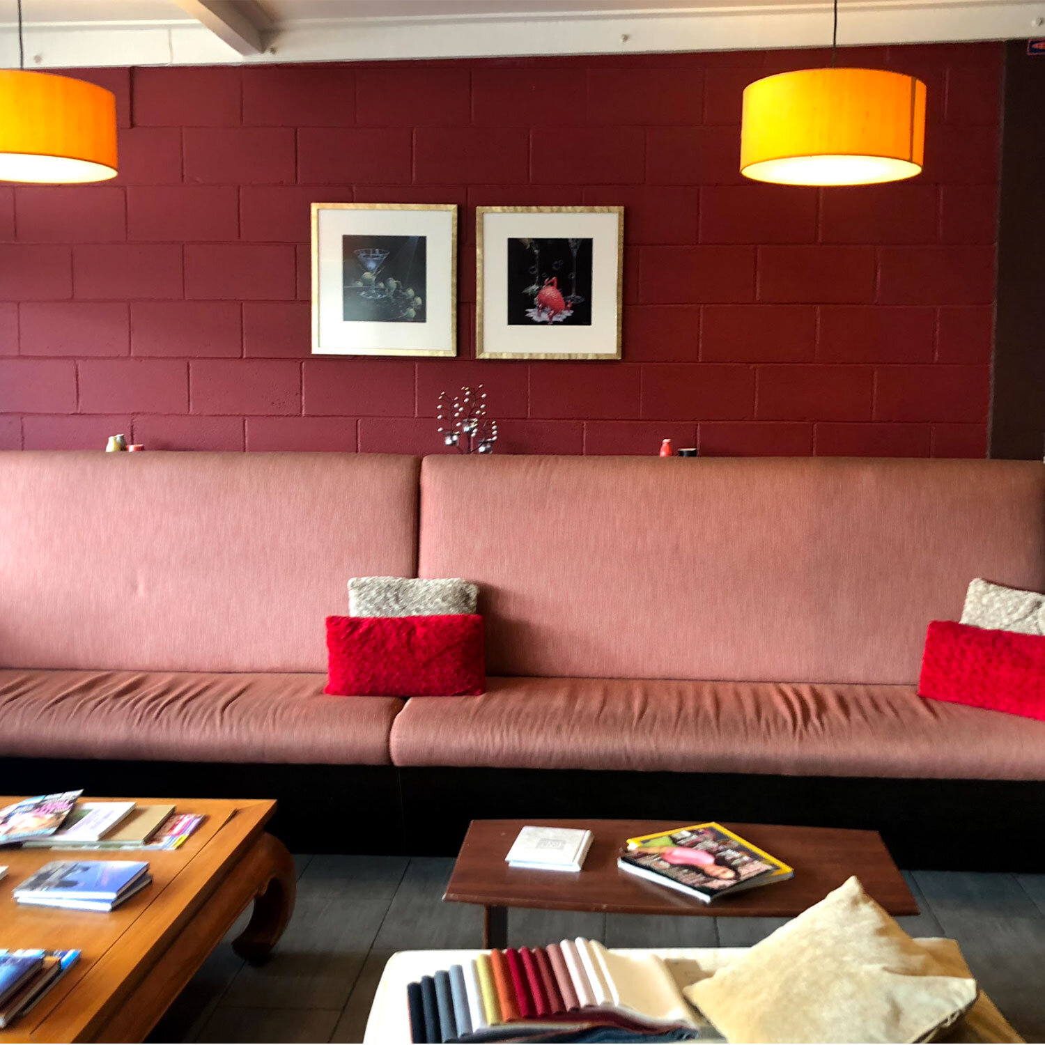
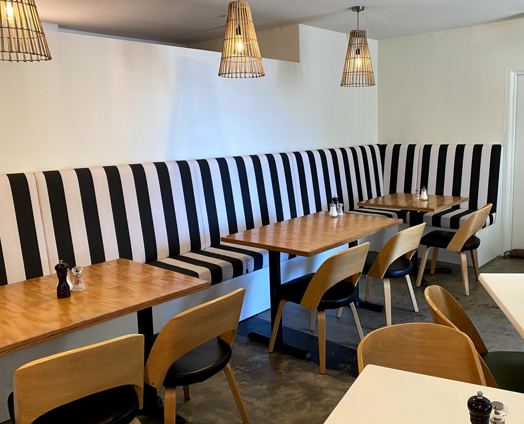
Due to client preference this revamp was to be completed in stages- and is currently still ongoing. Working within the parameters given, we focused our initial attention on upholstering the furniture and repainting the walls. We implemented booth seating, patterned fabric and cushions, updated lighting, and a fresh lick of white paint.
THE OUTCOME
Using rich patterns and textures to reflect the exotic feel of the interior, we were able to bring in a sense of drama and interest within the space, which was then balanced with neutral walls, and framed by brass-gold mirrors and lights to create a relaxing and plush dining ambience that truly emulated the brand of the Spice Room.
